What started as a referral for a logo became a full brand system.
Alex De León, a master groomer from Miami opening his first shop in Atlanta, gave me one directive: a bold icon built around a lion's mane. Everything else was mine to find.
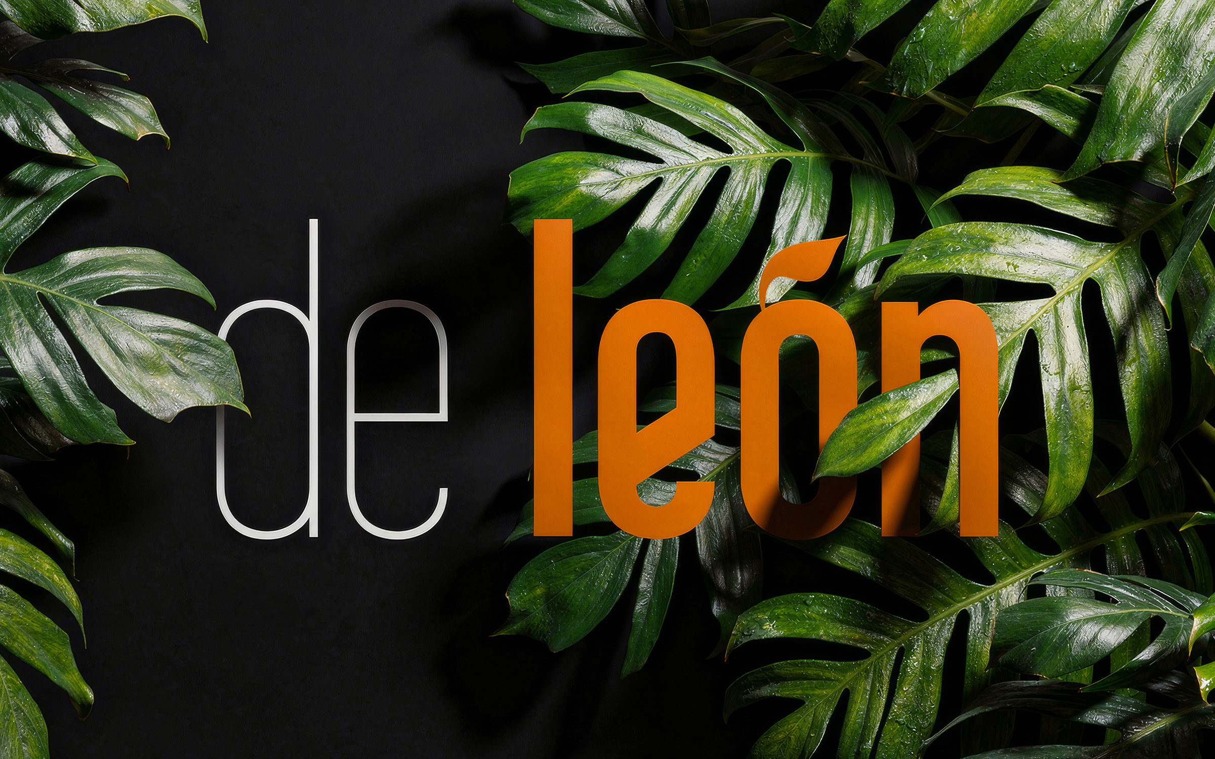
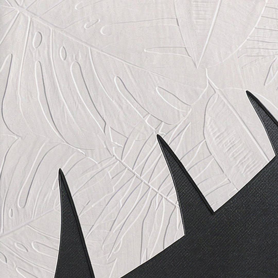
The Monstera leaf answered the brief in a way no literal lion ever could. Its silhouette mirrors the mane. It gave us something unexpected — plantlike and slightly feral — that landed perfectly with Alex, who also happens to be a self-proclaimed botanist. The palette was born from the collision of two cities: Atlanta's grit and Miami's color, united by the beauty in a decaying landscape.
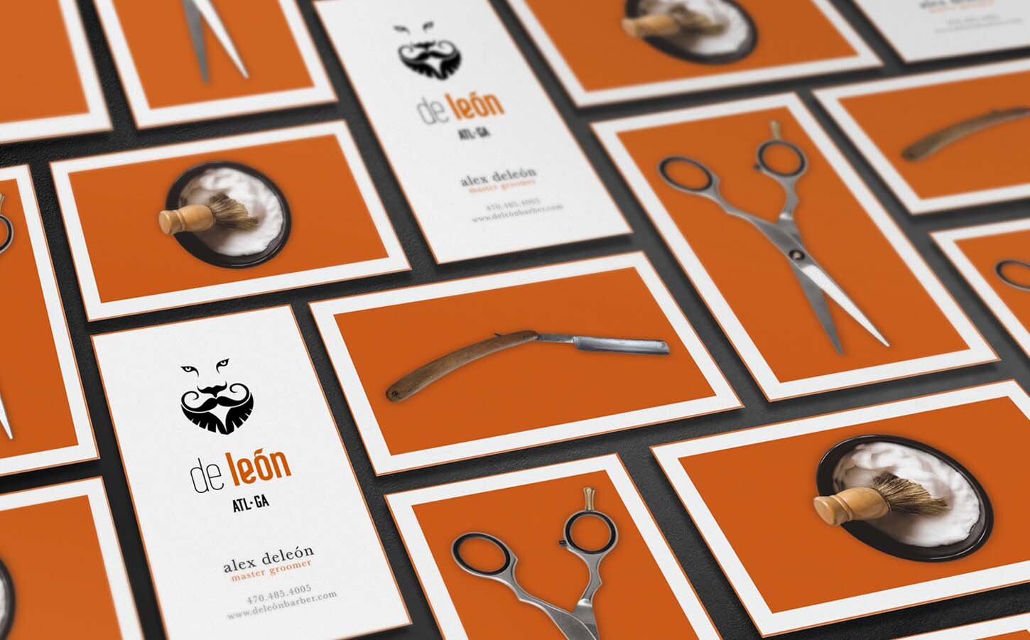
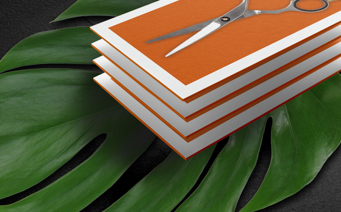
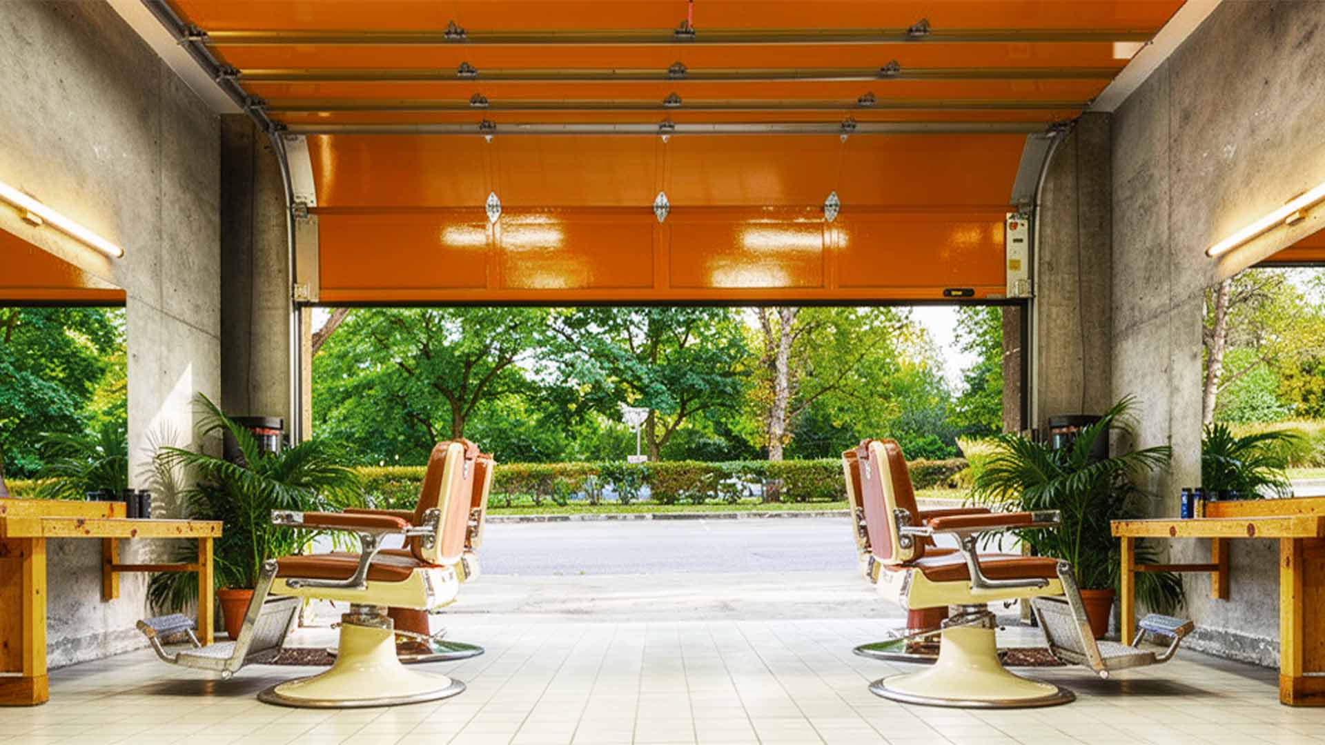
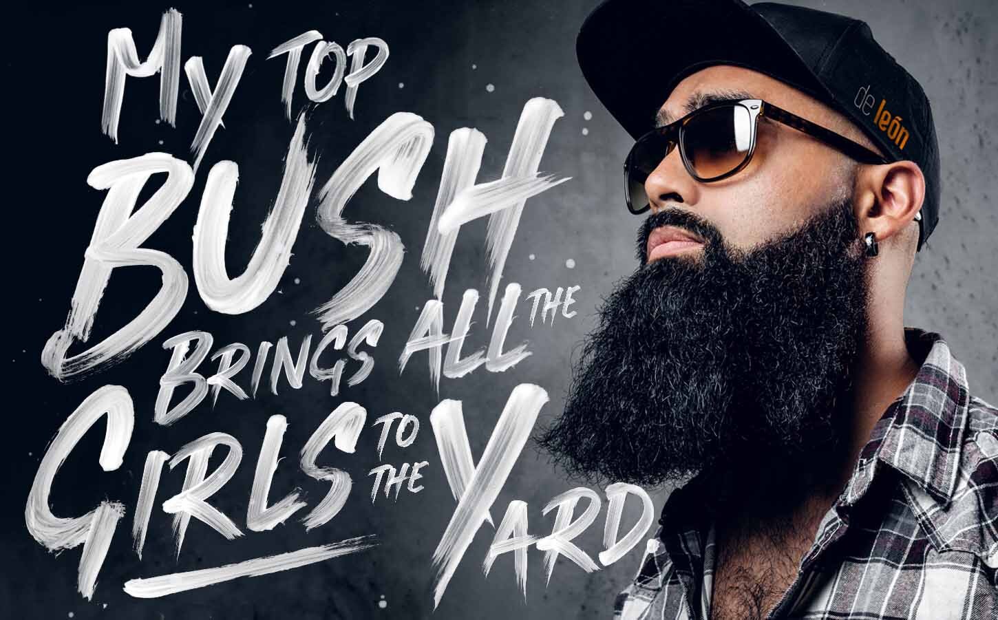
The system built outward from the mark: stationery, uniforms, apparel, retail signage, and the full Mane Tame product line — Alex's in-house men's grooming brand that needed its own logo, packaging, and advertising. A poster from this project ended up on the walls of Krog Street Tunnel. Magazine ads followed.
"The unexpected answer that, once seen, seems like the only one."
Strategic Insight
The lion and its mane became the organizing idea for the entire brand. One recognizable symbol, built to carry meaning before a single word is read. The work was about turning a local barbershop into a destination brand. The mark had to hold up on exterior signage, on product labels, in the physical space, and across the experience of being in the chair, without losing its weight at any size. The tone balances masculine confidence with refinement and an approachable edge, premium without being precious. The result functions as a complete identity system rather than a logo applied to things. The symbol leads, and everything else falls in behind it.
Creative Direction
One system. Four applications.
On the mark
The Monstera leaf as lion’s mane is a single-image conceptual solution: one silhouette doing two jobs simultaneously. That kind of economy is what separates identity design from decoration.
On the color palette
Atlanta and Miami don’t share a visual language by default. The palette was built to hold both: warm without being tropical, urban without being cold.
On Mane Tame
A product line within a service brand requires its own visual logic. Mane Tame has the same DNA as De León but reads as its own thing, because it needed to live on a shelf, not just in a shop.
On uniforms
A uniform is daily brand expression. When it’s designed with the same intention as the logo, the shop floor becomes part of the brand system.


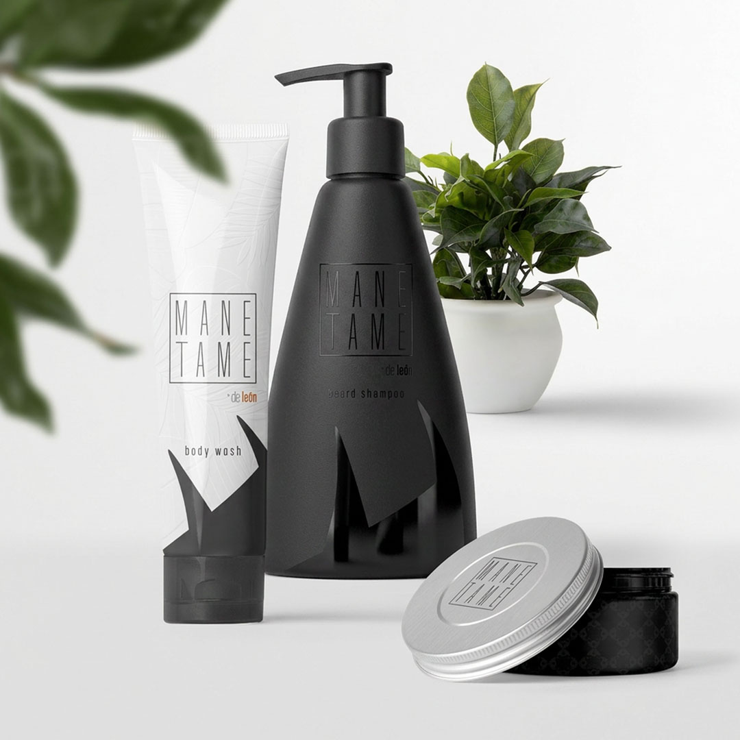
"A brand within a brand — Mane Tame, built to live on a shelf"


"Haircuts for the Homeless. A Brand Built for All of Atlanta."

When Andrew showed me the new logo, I knew right away he saw the business the way I wanted people to experience it. After that, I trusted him completely. He shaped the creative direction from the uniforms to the storefront, the interior details, the tone of the brand, and even the music playing in the shop. He didn’t just make De León look better. He gave the whole place a point of view.
— Alex De León, De León Barbershop
Project Close
De León is what happens when the brief is honest and the creative response goes all the way. The botanical answer to a lion’s mane brief is not the obvious move — but it’s the right one, and the system built from it proves why. A full identity, a retail product line, uniforms, signage, and a wall at Krog Street Tunnel. Alex De León gives free haircuts to the homeless of Atlanta. It was worth building something that matched that character.