Gearbox started as a product idea I couldn't shake.
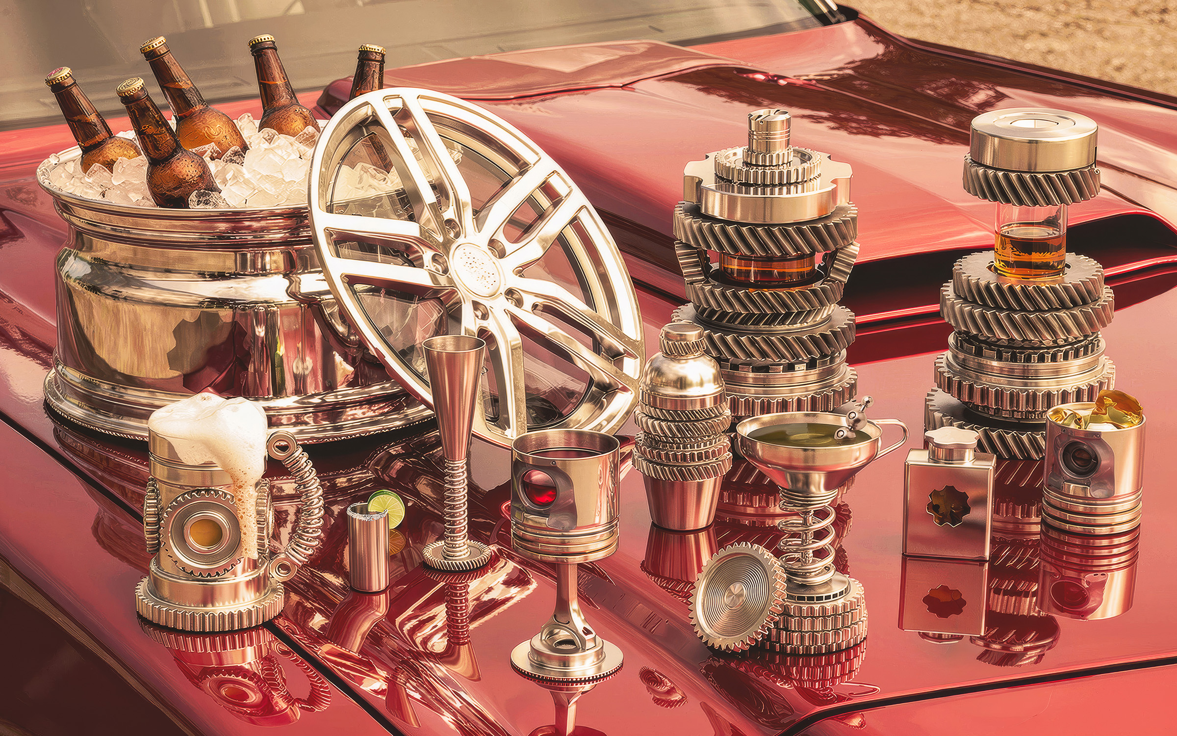
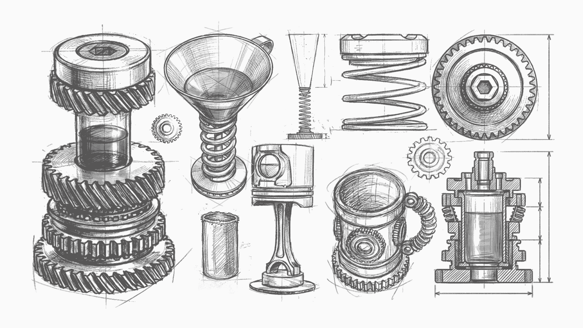
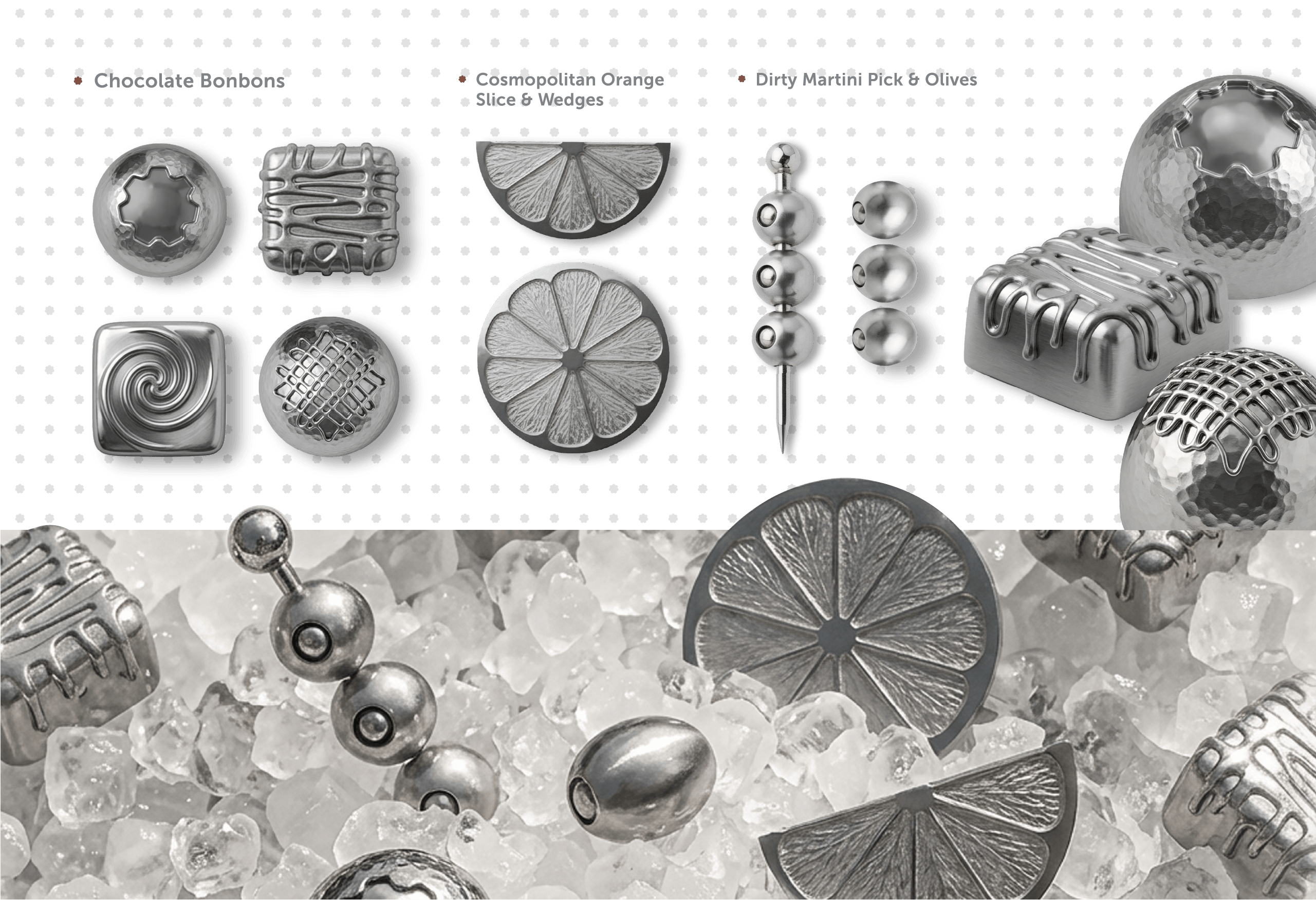
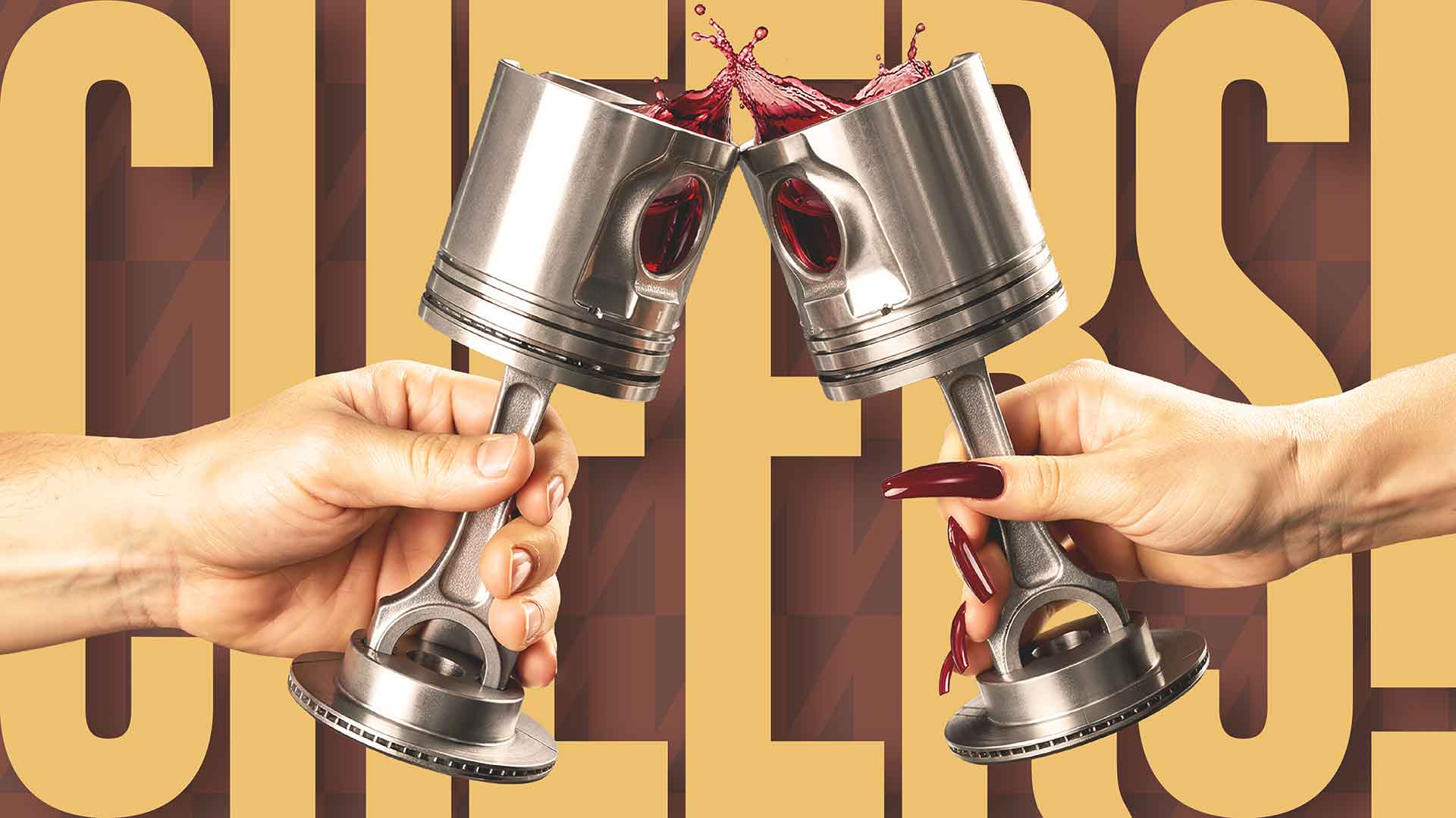
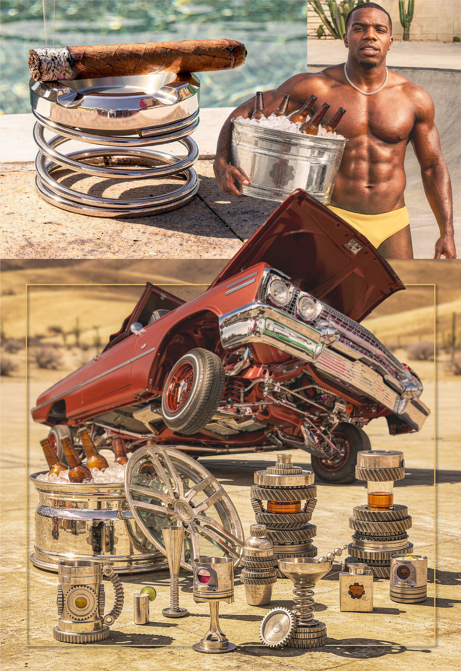
Premium metal drinkware built on the visual language of the garage — pistons as wine caddies, engine geometry translated into glassware forms. I sketched the collection in 2017 and spent years waiting for the right tools to tell the full story.
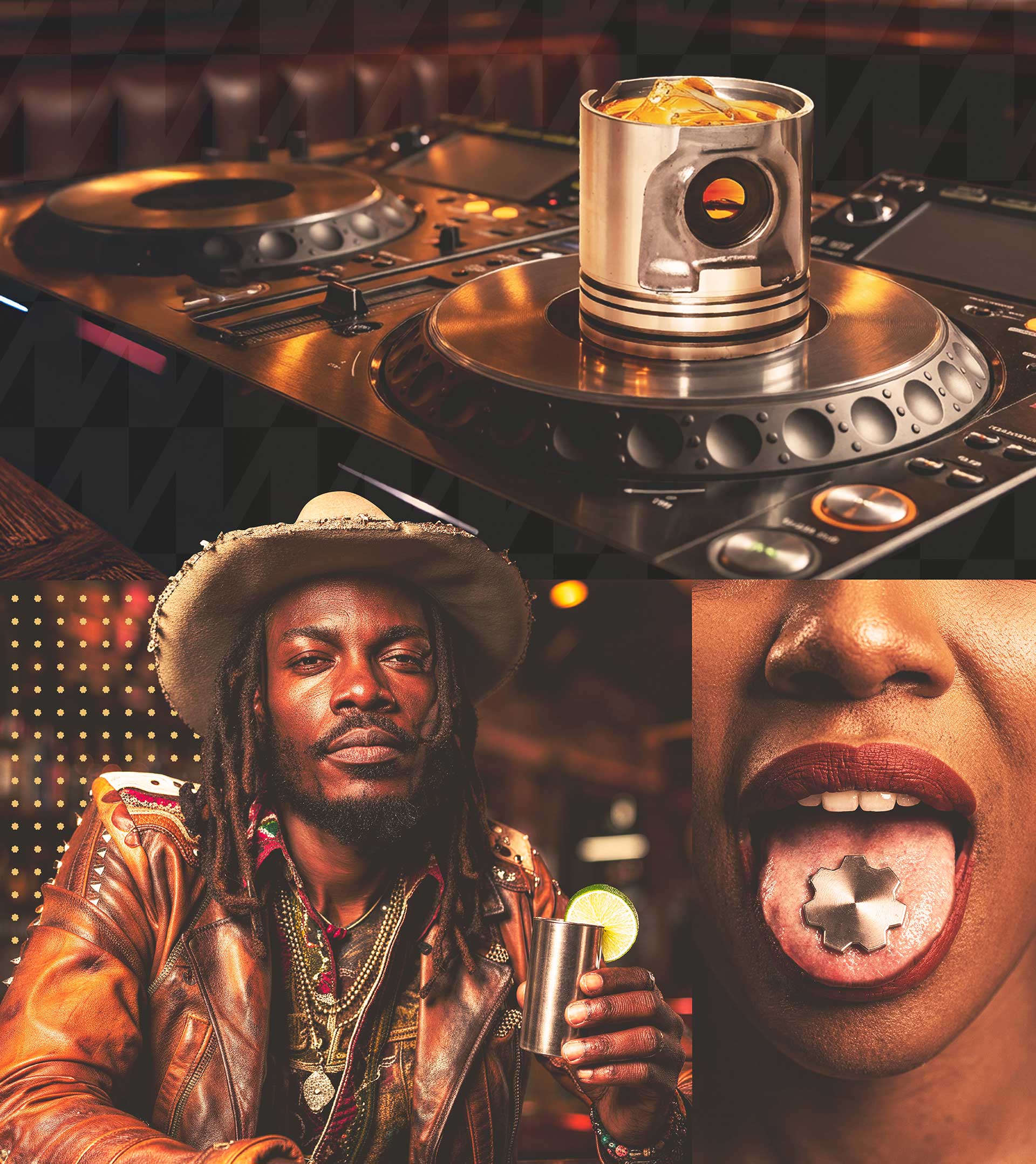
In 2025 I revisited it with generative imaging tools and treated AI like a production studio. I art directed every scene: lighting, camera angle, product placement, reflections on metal. The work is mine. The tools handled what a shoot budget couldn't. Everything else — the naming system, logo, color, patterns, iconography, packaging architecture, and brand voice — was built the same way it's always been built.
What came out the other side is a complete lifestyle brand. Collectible product line. Scalable identity. A world you can step into. Gearbox is still a concept, but it doesn't look like one anymore.

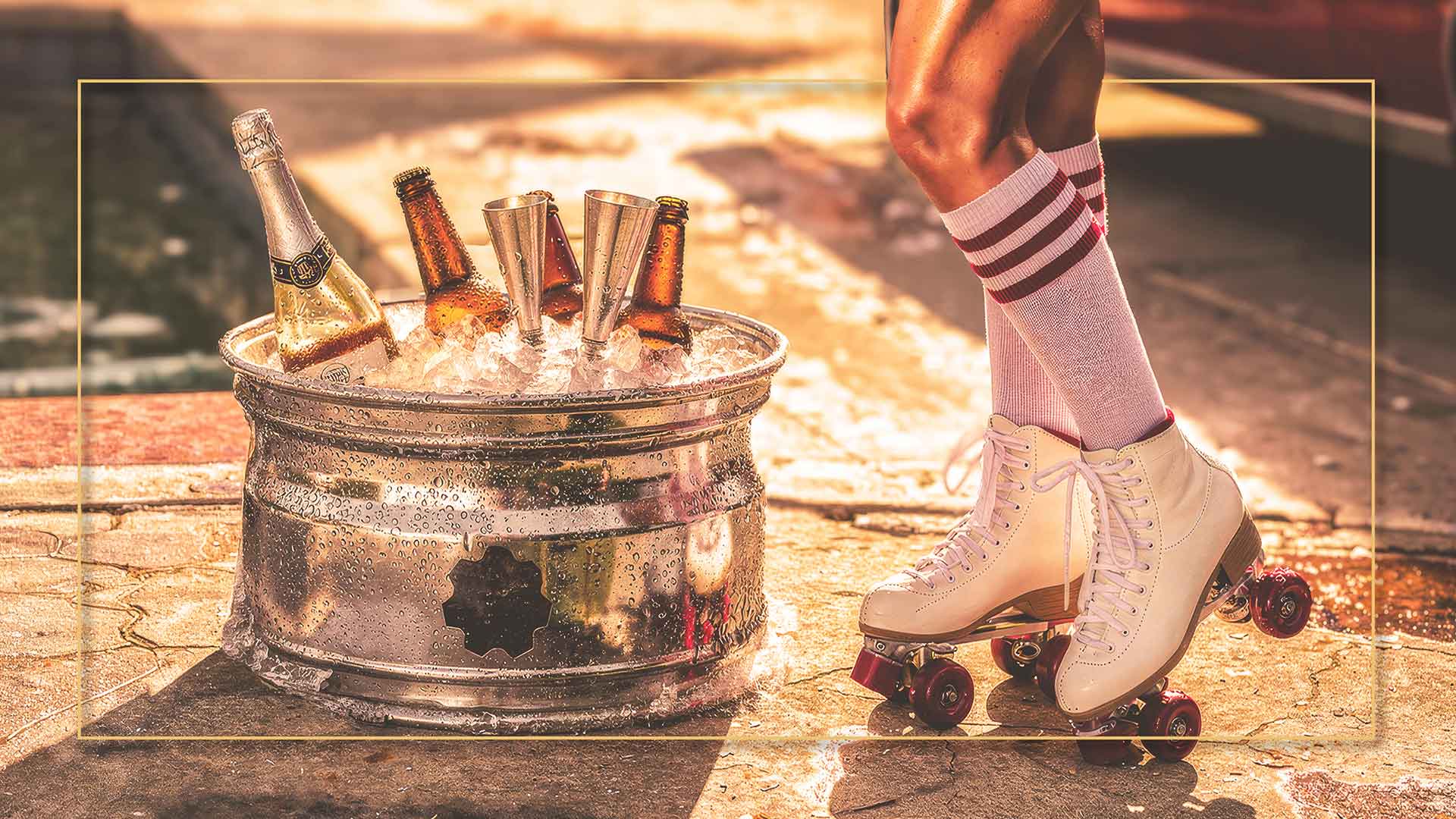
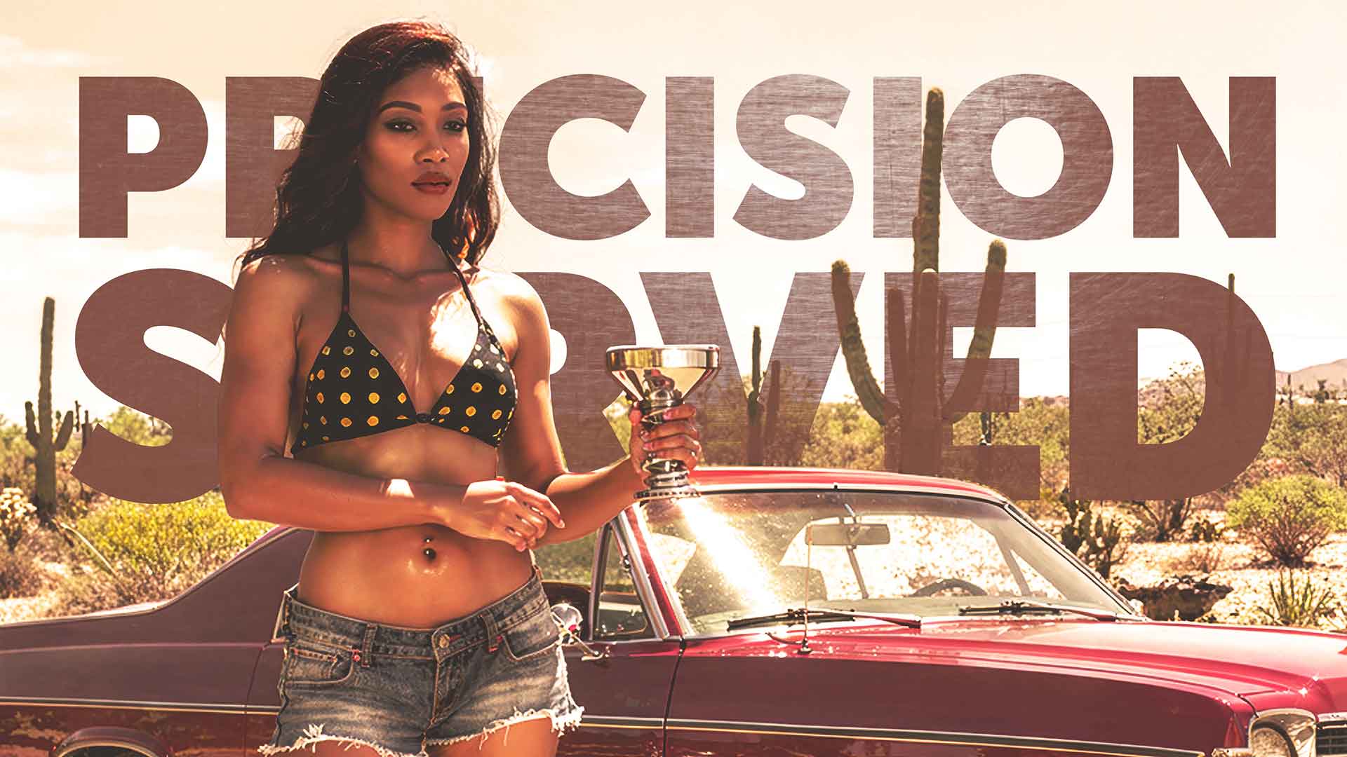
The problem was never the product. It was the world around it. Without physical prototypes and a real shoot budget, I couldn't build the lifestyle campaign this brand needed — vintage cars, poolside scenes, bar setups, the kind of imagery that makes drinkware feel like culture instead of inventory.


Strategic Insight
The market for premium drinkware is crowded with heritage brands and DTC minimalism. Gearbox occupies a third lane, industrial luxury, that currently has no real tenant. The audience is the collector-minded consumer who builds a garage the same way they build a bar: with reverence, with specificity, with taste. They don't buy drinkware. They acquire it. The design language had to reflect that psychology, tactile, dense, machined, while remaining legible as a lifestyle object, not a novelty. The tension between precision engineering and sensory pleasure is the brand.

"The concept looked like a concept. Then it didn't."

Creative Direction
One brand. Five deliberate decisions.
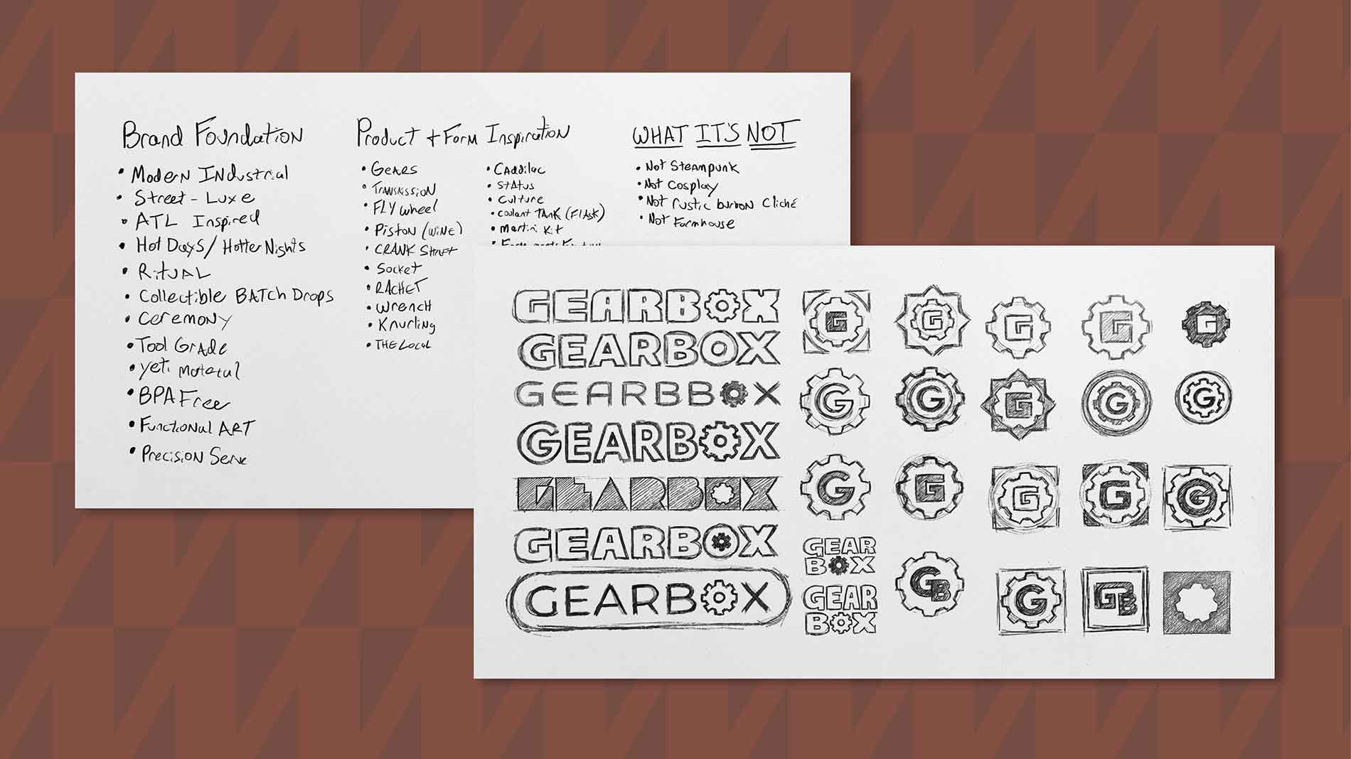
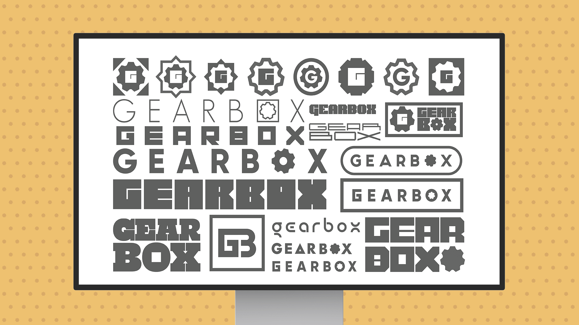
On the naming system
Every product name carries mechanical weight: language borrowed from the garage, repositioned to live on a shelf. Names that feel earned, not invented.
On Color
Matte black. Raw aluminum. Oxidized bronze. Oxblood. Pastels. No gradients. The palette is a parts catalog, not a mood board.
On Typography
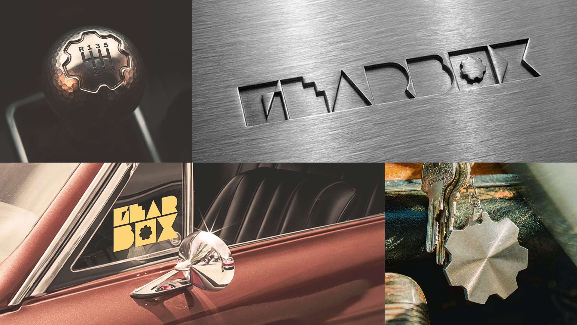
Compressed, industrial, uppercase. Set tight. The type should feel like it was stamped into metal, not printed on paper.
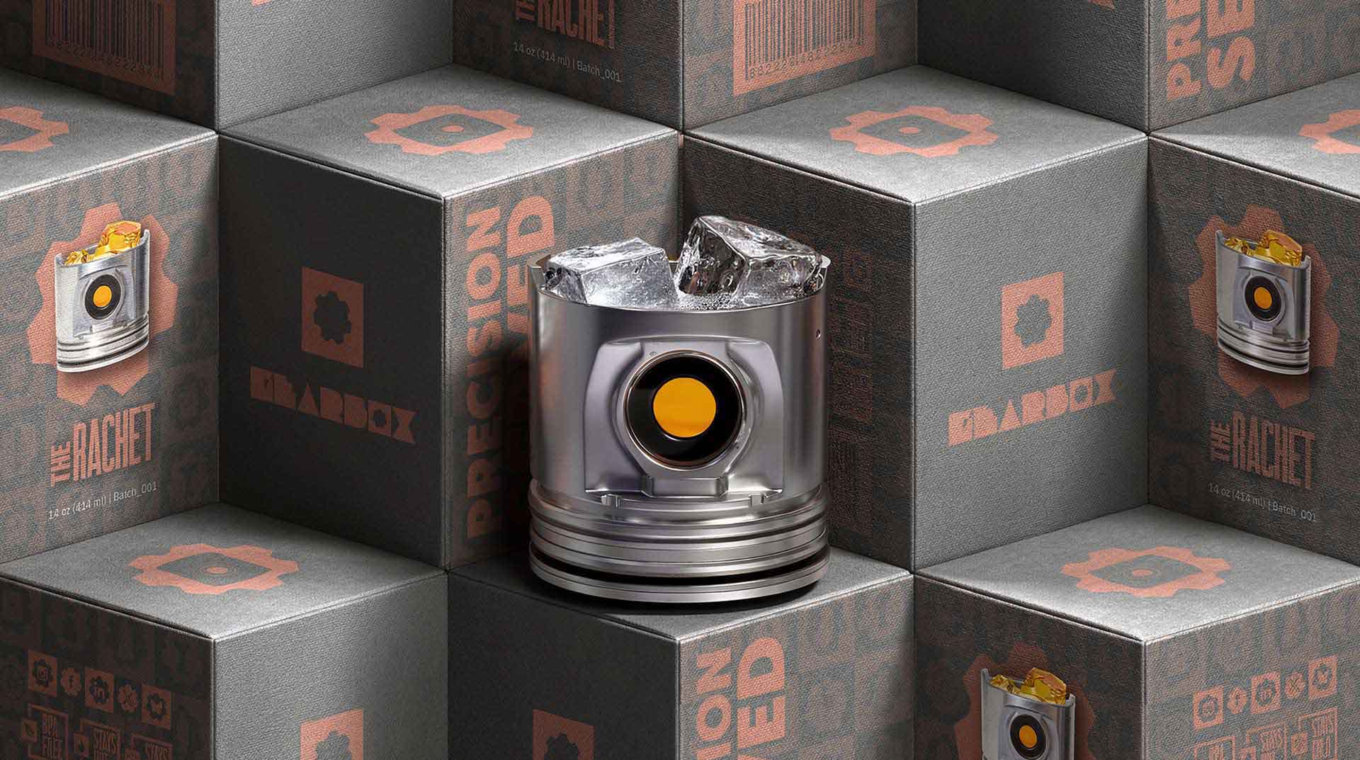
On Packaging
Designed to feel like you're opening something that was built to last. Weight matters. Closure matters. The unboxing is part of the product.
On AI Direction
Every scene was treated as a shoot. Lighting was a decision. Angle was a decision. Reflections on metal were deliberate. The tool was the camera. The direction was mine.

"Precision Served."


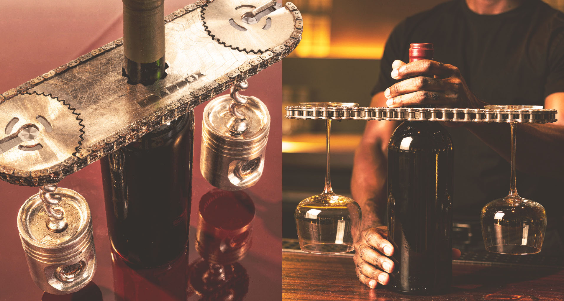


"The visual language of the garage, translated for the bar."


Project Close
Gearbox proves something worth proving: that a concept brand, built with the same rigor as a funded one, can own a market position before the product ships. The identity system is complete. The lifestyle world is established. The brand is ready for a manufacturer, a retail partner, or a licensing conversation. The work was done at the level the brand deserves — because anything less would have been the wrong kind of concept.