

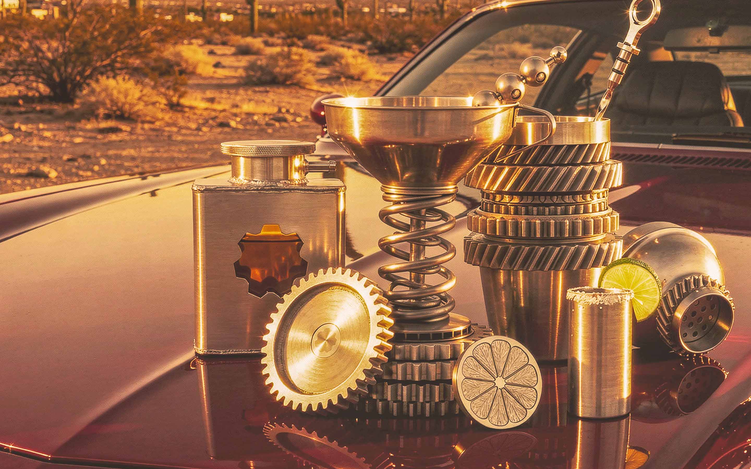
Gearbox started as a product idea I couldn't shake. Premium metal drinkware built on the visual language of the garage: pistons as wine caddies, engine geometry translated into glassware forms.
I sketched the collection in 2017 and waited years for the right tools to tell the full story. In 2025 I came back to it with generative imaging and treated AI like a production studio. I art directed every scene: lighting, camera angle, product placement, reflections on metal. The work is mine. The tools handled what a shoot budget couldn't. Everything else, the naming system, logo, color, patterns, iconography, packaging architecture, and brand voice, was built the way it has always been built.
What came out the other side is a complete lifestyle brand. A collectible product line. A scalable identity. A world you can step into. Gearbox is still a concept, but it doesn't look like one anymore.
ROLE
Creative Direction · Brand Identity · Industrial Design
PROJECT
Self-Initiated Concept
INDUSTRY
Lifestyle · Drinkware · Automotive
DELIVERABLES
Identity · Packaging · Product · Campaign
TOOLS
Brand Design · AI-Directed Visualization
Challenge
A drinkware line with no prototypes and no shoot budget. The product was never the problem. The world around it was.
Approach
Build the brand first. Names pulled from the garage, a palette read off a parts catalog, type set like it was stamped into metal rather than printed.
Outcome
Twelve products, a packaging architecture and a full lifestyle campaign. Still a concept. It stopped looking like one.
FIRST ATTEMPT · 2017
The problem was never the product. It was the world around it. Without physical prototypes and a real shoot budget, I couldn't build the lifestyle campaign this brand needed: vintage cars, poolside scenes, bar setups, the kind of imagery that makes drinkware feel like culture instead of inventory.

The full collection. Twelve pieces, one material language, no decorative parts.
IDENTITY · LOGO DEVELOPMENT
The wordmark. Compressed and tight, set like it was stamped into metal rather than printed.
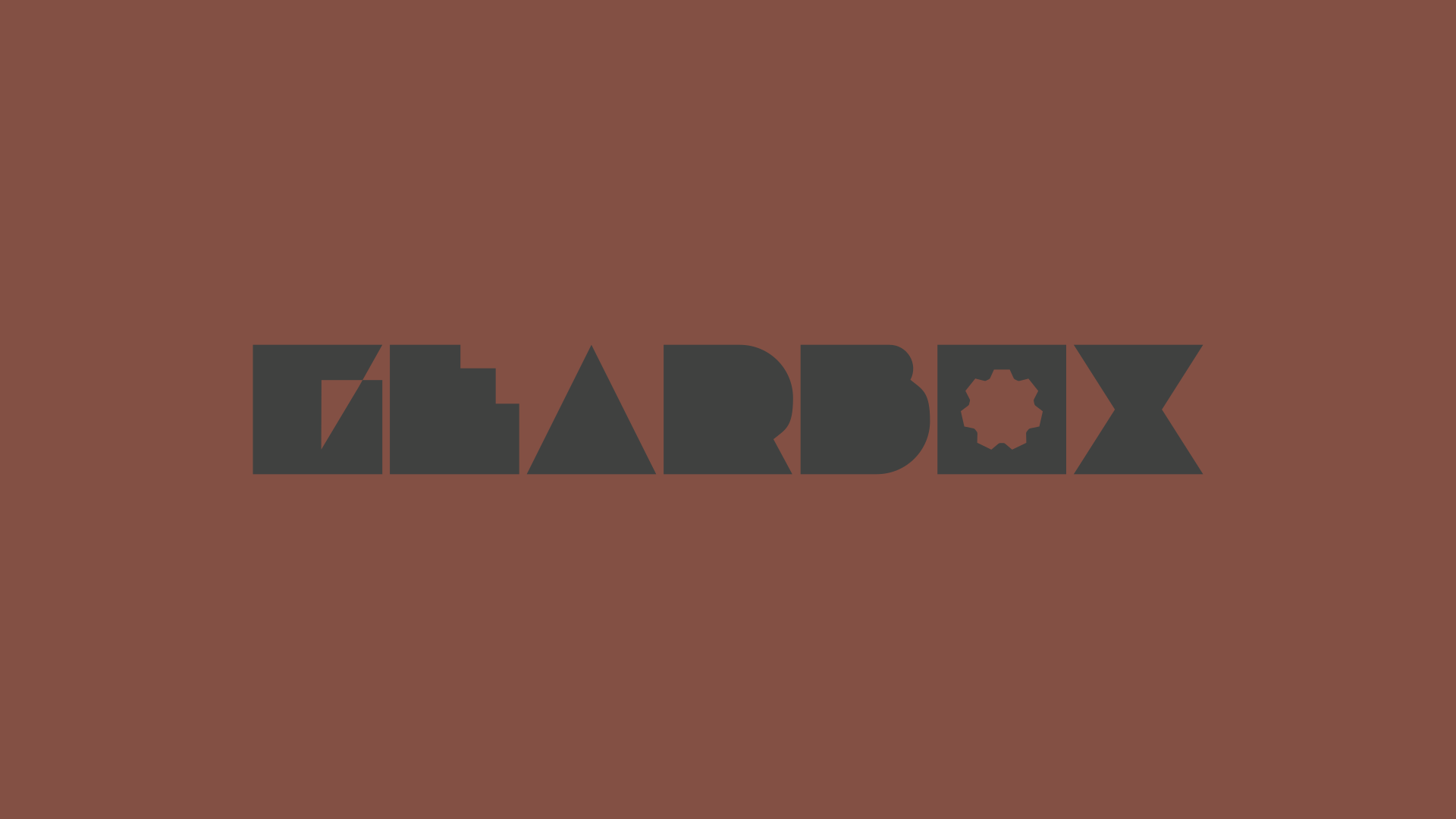
The full lockup. Every letter is a machined part. The O is a cog, the X is two wedges meeting.

Reduced to one cog. Small sizes get the part, not the word.
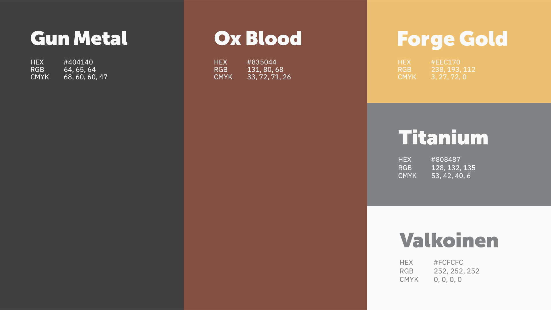
The palette reads like a parts catalog. Matte black, raw aluminum, oxidized bronze.
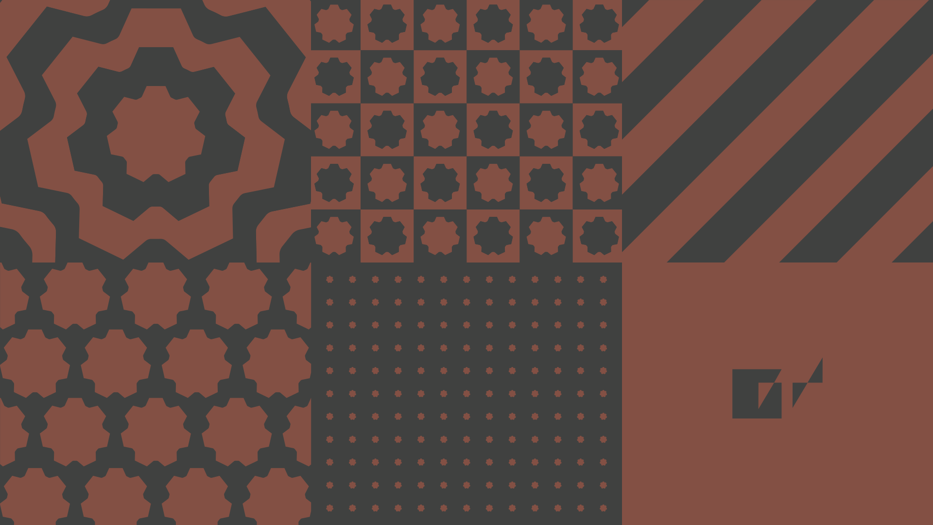
Pattern built from the product silhouettes, so the system describes its own inventory.
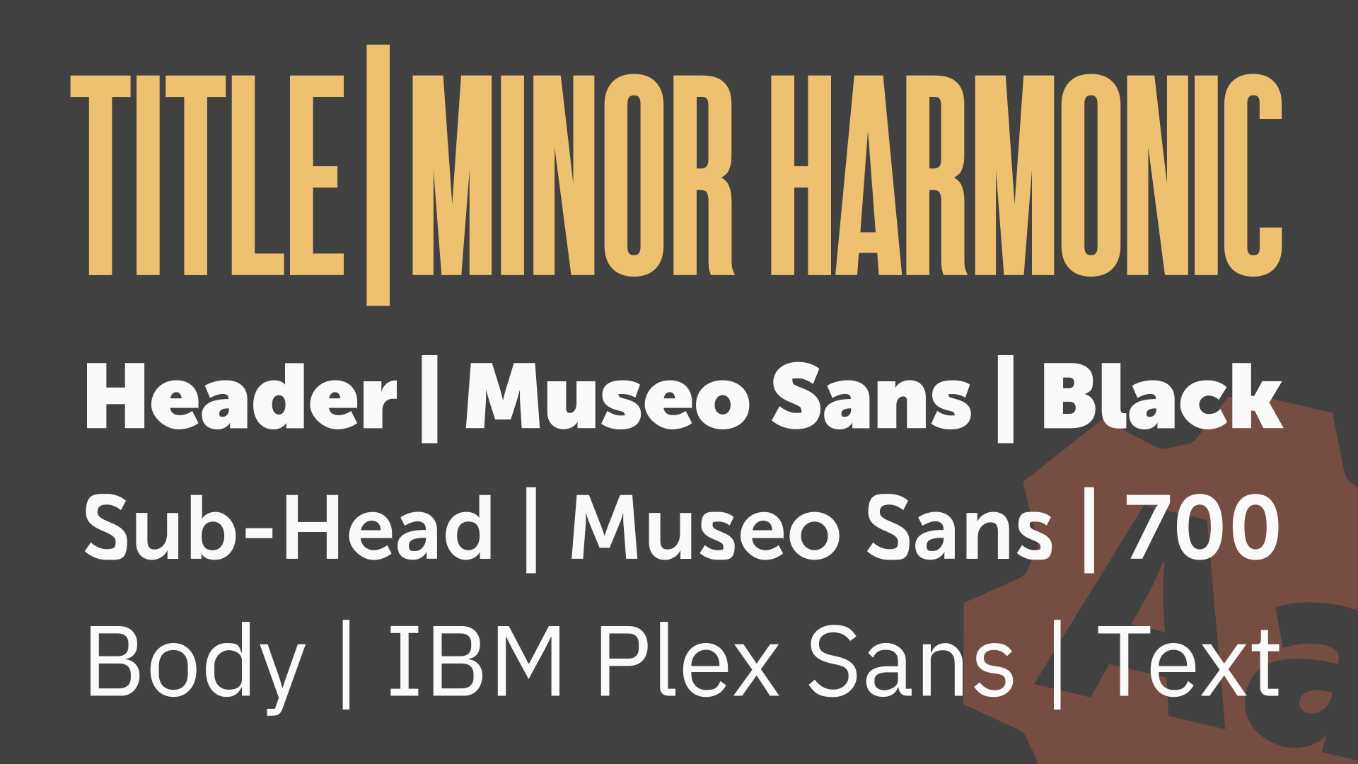
Type specimen and color chips. Every value named the way a supplier would name it.
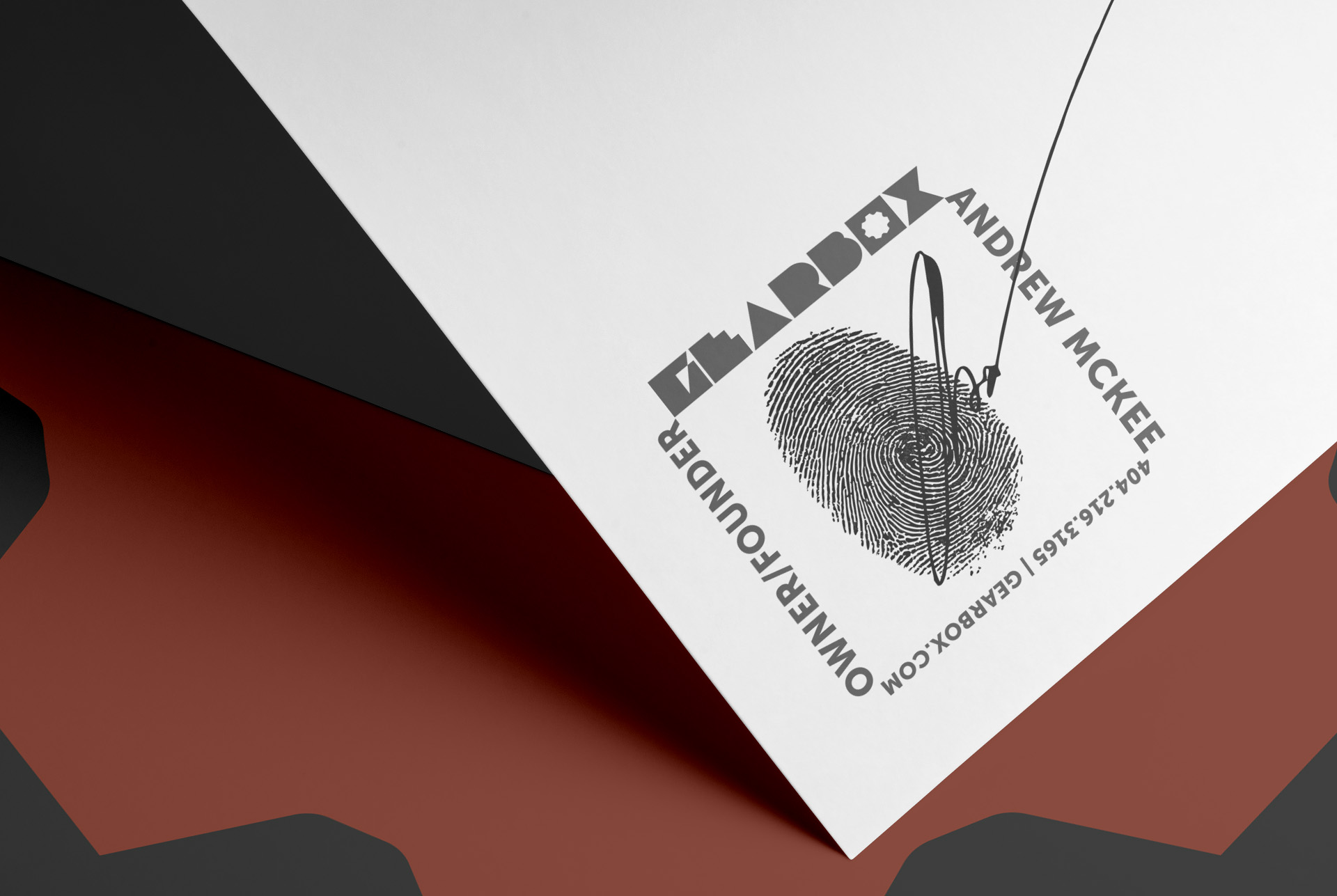
Collateral and packaging together. The system holds at every scale it was asked to.
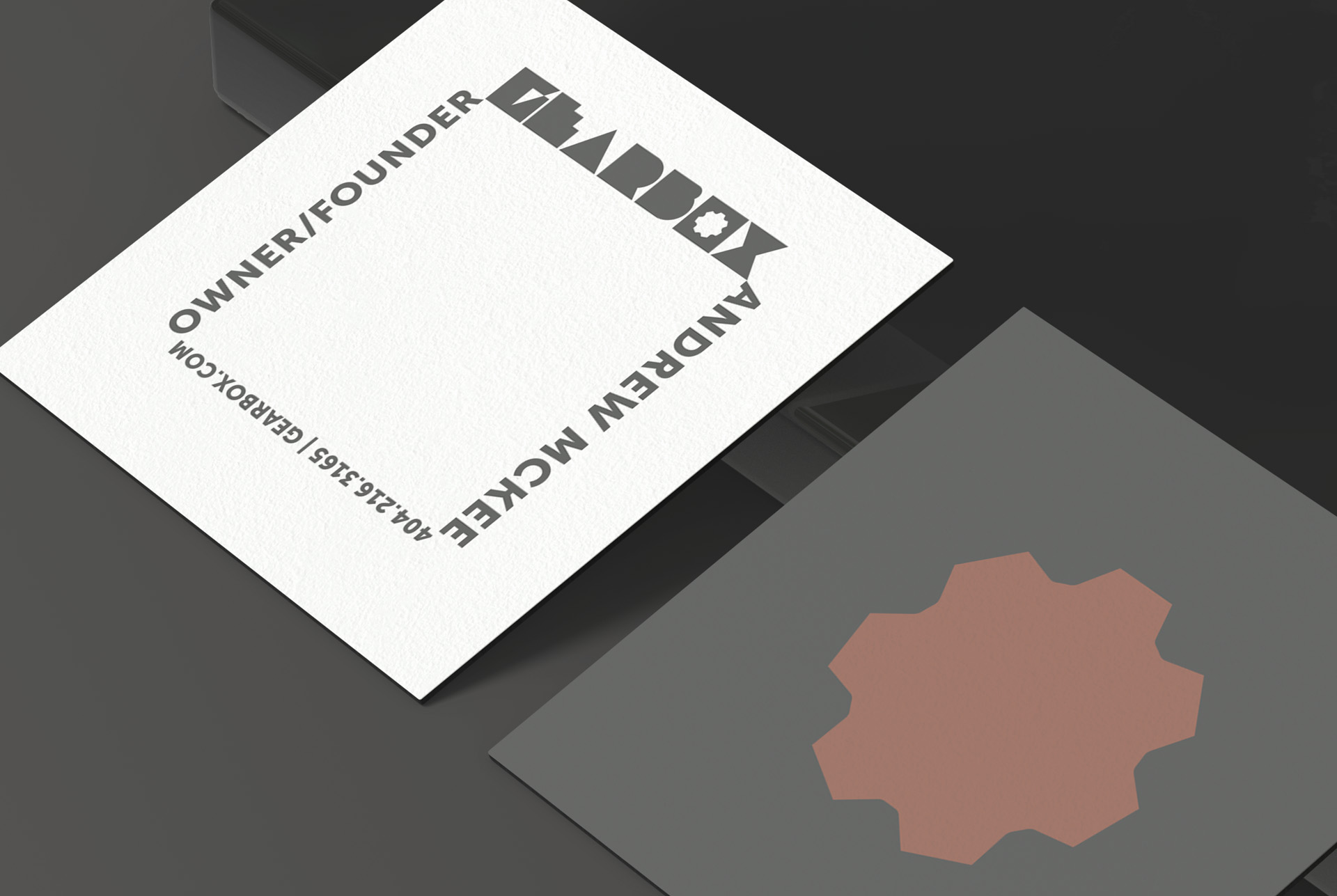
Letterpress card. The cog rosette carries the brand wherever the wordmark will not fit.
STRATEGIC INSIGHT
Gearbox feels like one brand because every decision points the same way. The names come from the garage. The palette reads like a parts catalog: matte black, raw aluminum, oxidized bronze. The type is compressed and tight, set like it was stamped into metal rather than printed. None of it is decoration. It all describes the same world, which is usually the thing a concept is missing.
PROJECT IMPACT
01
Identity System
02
Product Naming
03
Product Design
04
Packaging
05
Lifestyle Campaign
REVISITED · 2026 · BATCH 001

2017 sketches, dimension lines and all. The forms had to work before the brand could.

Shot on a hood. The product was always meant to live where it came from.
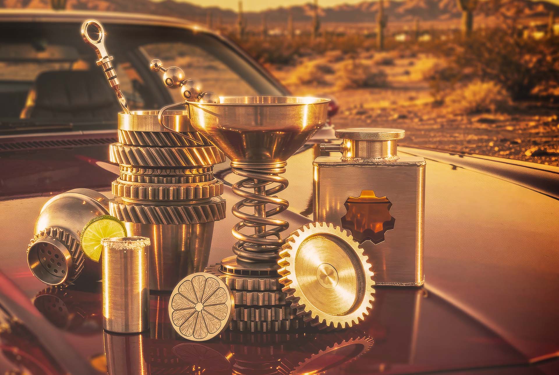
Golden hour on a hood. Brass finish, desert road, the world the 2017 version never got to have.
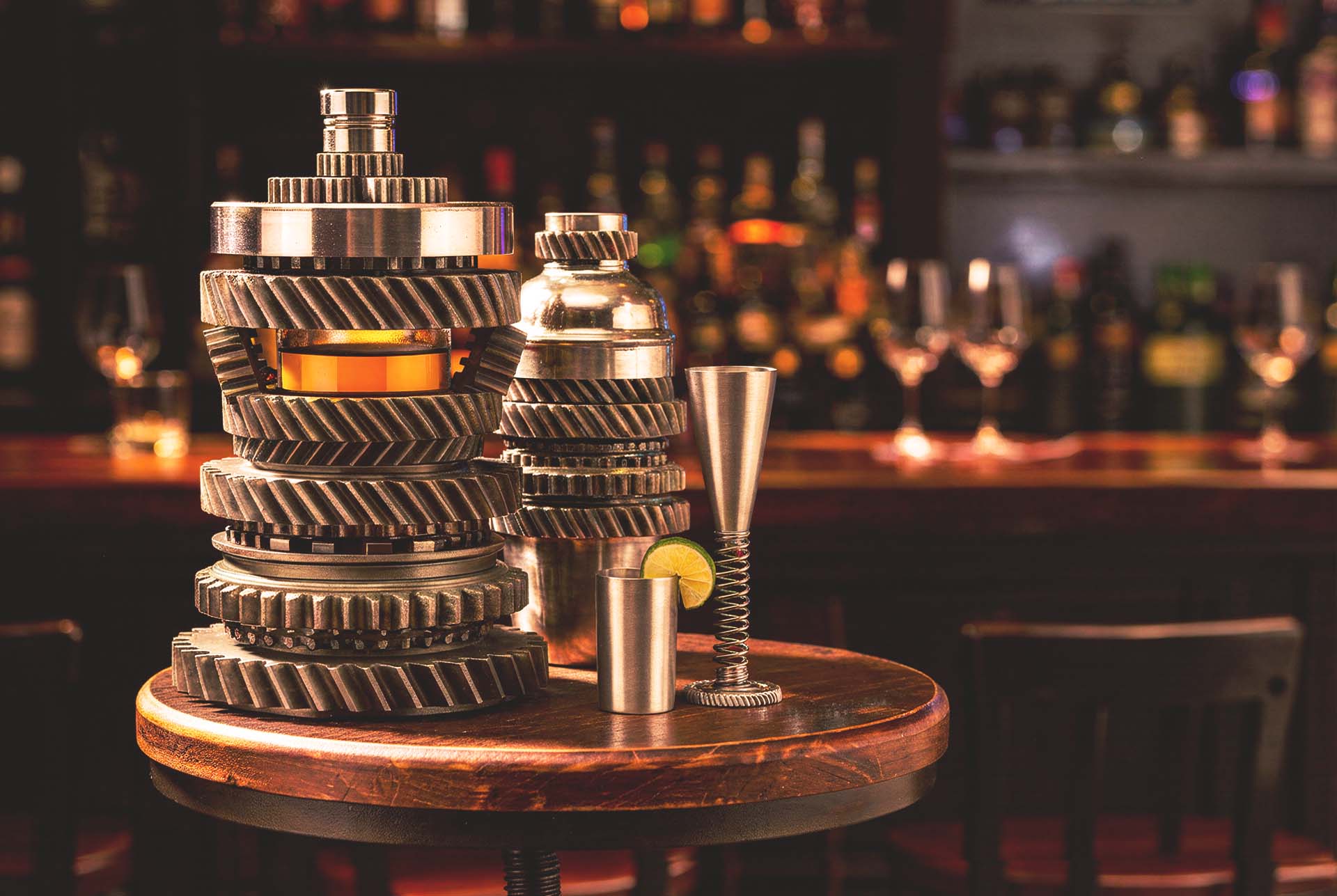
Stacked gear tumbler on a bar stool. The amber does the lighting work.
MARTINI KIT · BAR TOOLS

Bar tools drawn straight from the toolbox. Nothing here is wearing a costume.
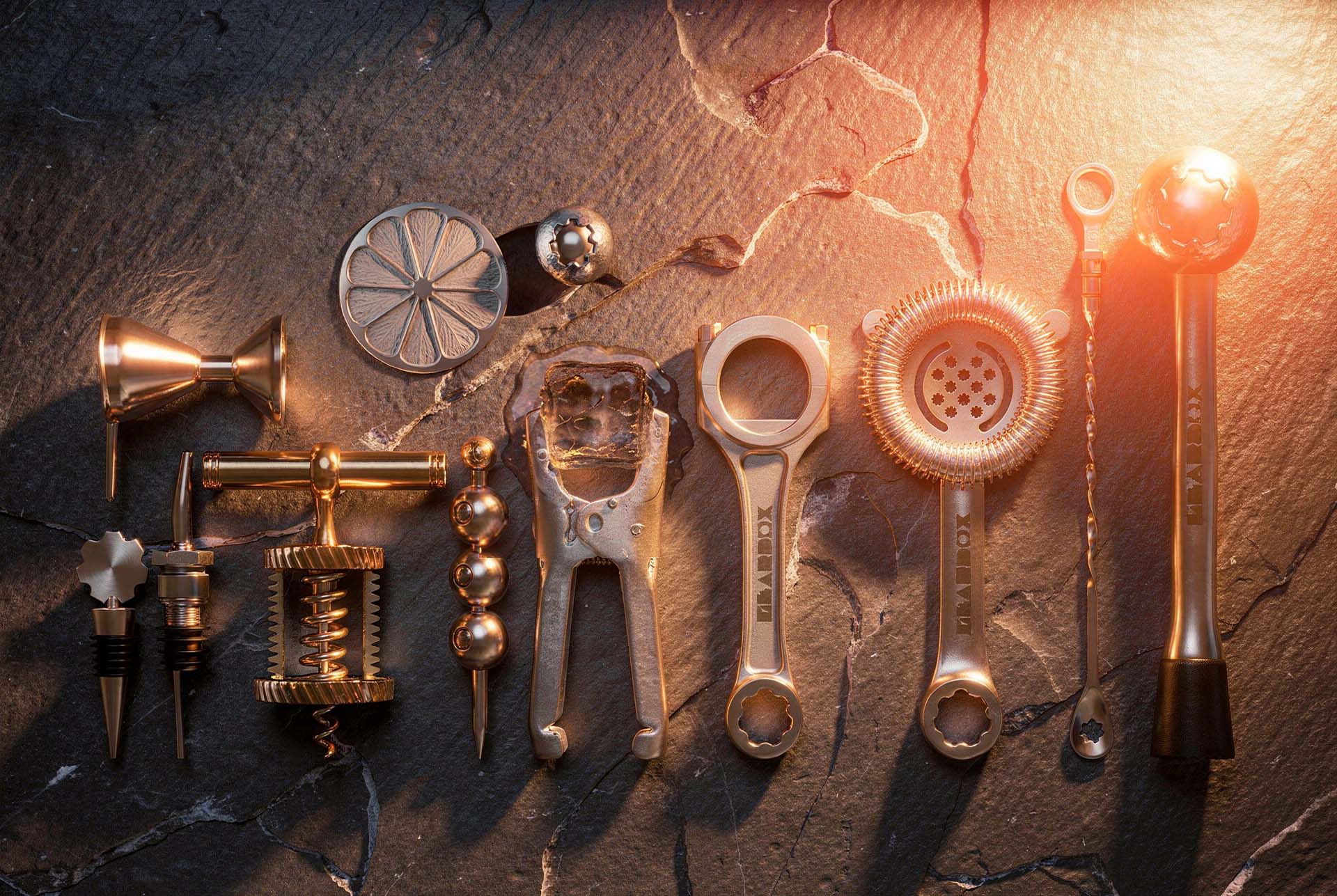
Garage pegboard as retail fixture. Shadow boards for magnets and stemware, caddies hung like tools.
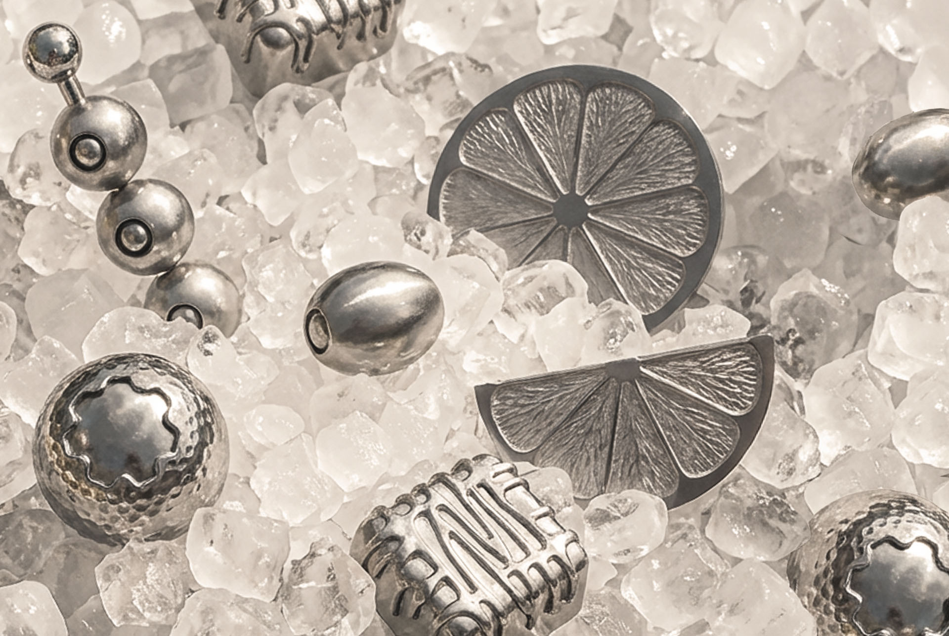
Titanium ice. Ball bearings, olives and citrus wheels cut in metal, so nothing waters down.
WINE CADDY
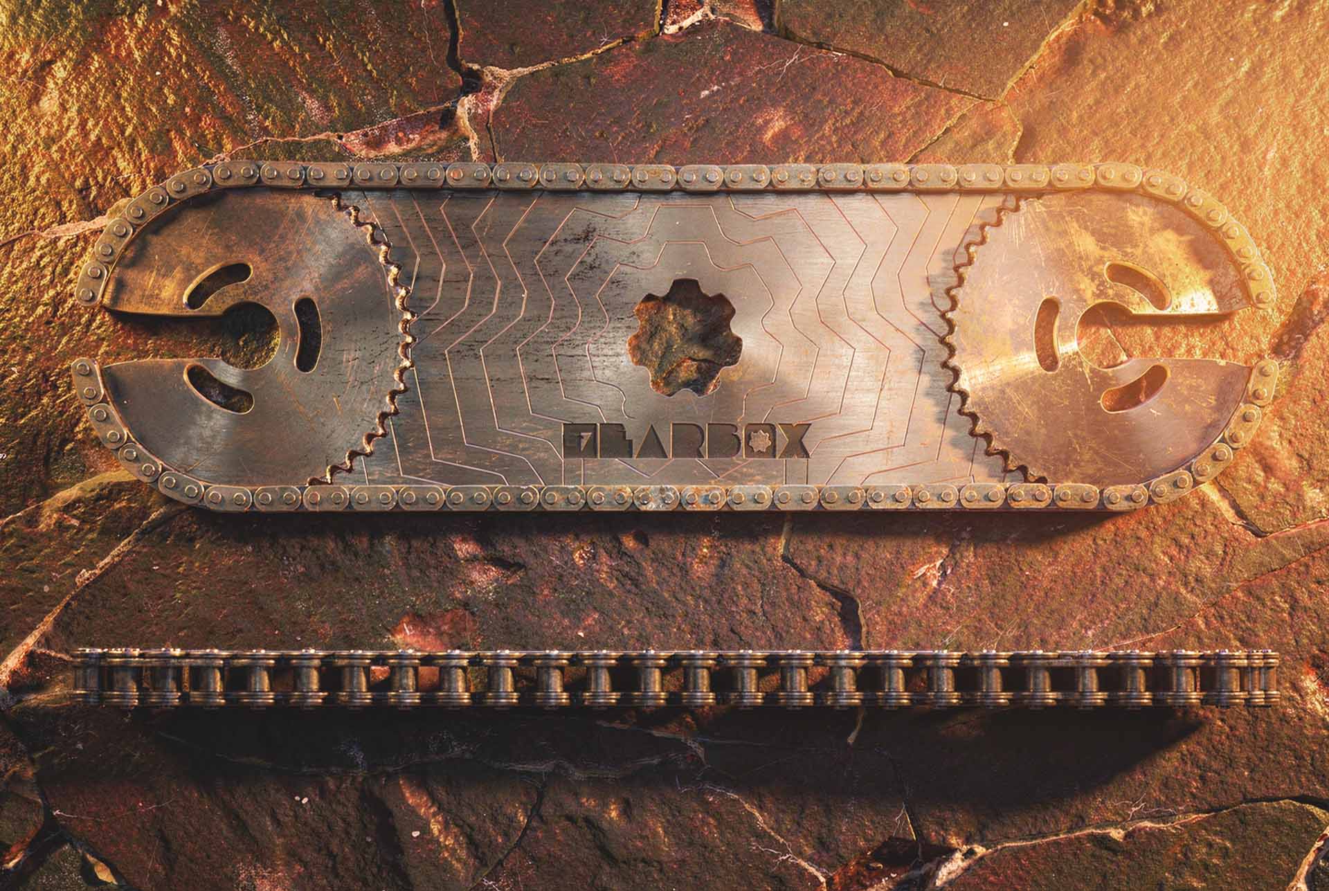
The Bracket. A machined sprocket and chain, etched with the mark and built to hold a bottle.

Close on the chain and the etched plate. The Bracket does not hide what it was made from.
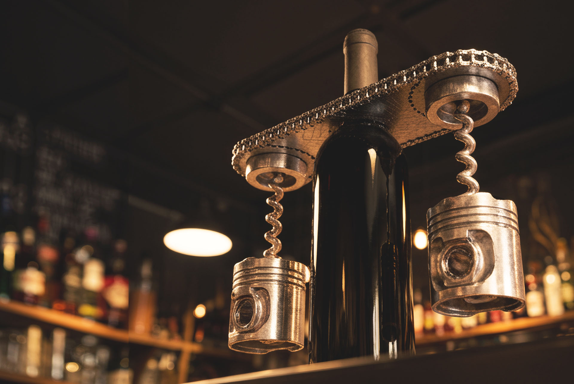
The Bracket in service, with piston bodied corkscrews alongside it.
PACKAGING · BRANDING
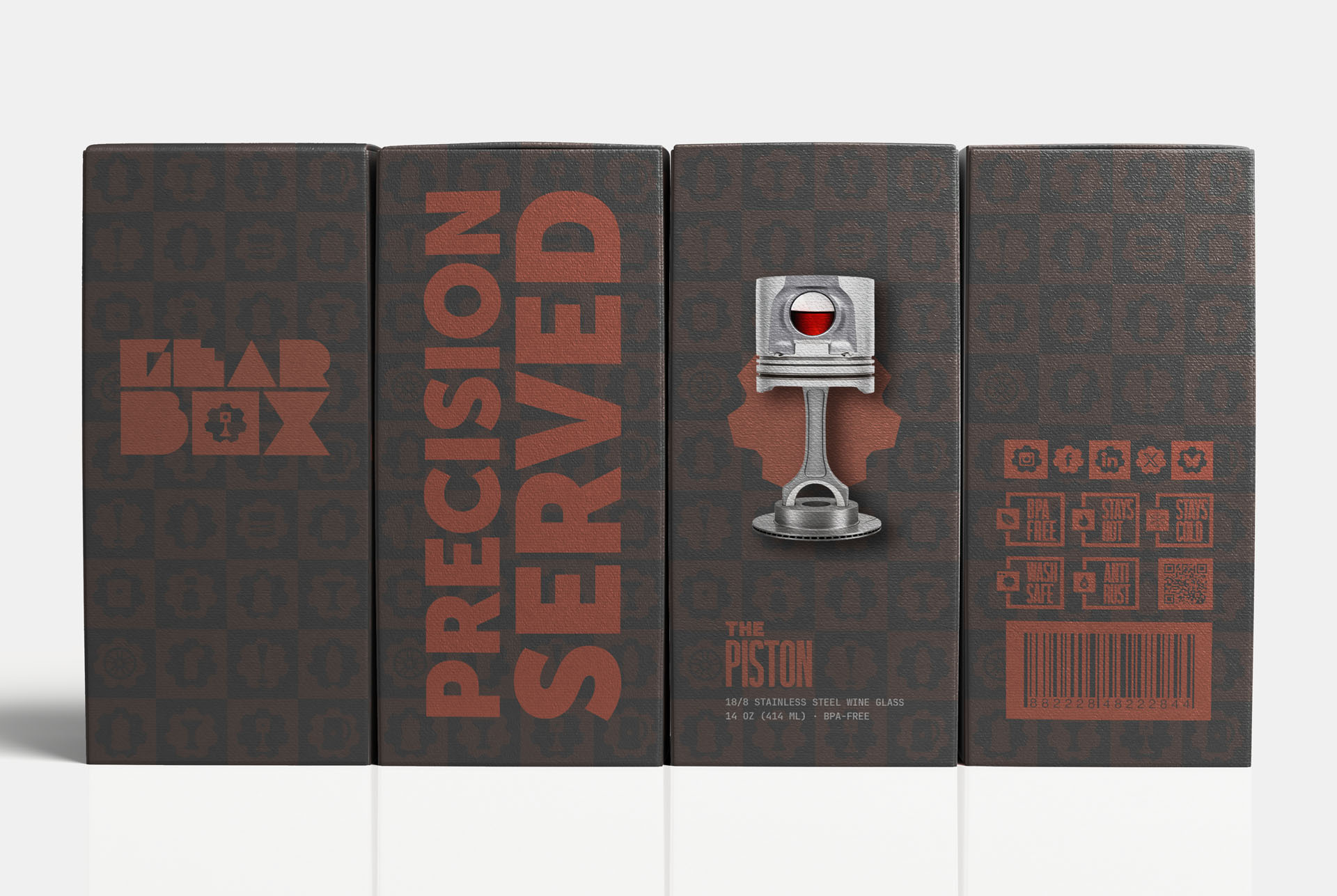
The Piston packaging. The silhouette does the naming, so the box only needs one line of type.
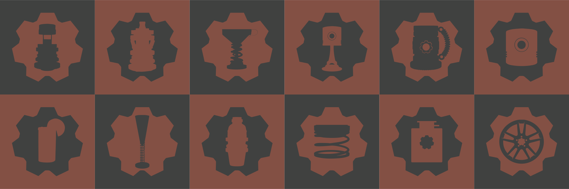
Product marker icons. A visual inventory of what exists, what is next, and what still deserves building.

The Torque, boxed. A gear bodied stein with a coiled spring handle, and a box that needs one word.
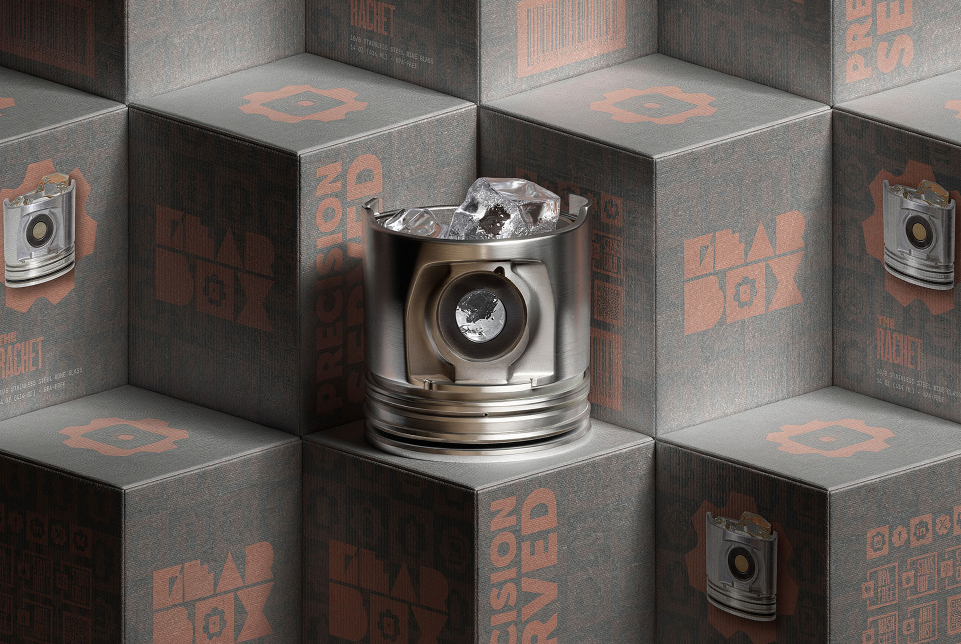
The packaging tessellates. Stack it and the silhouette pattern becomes the shelf.
ART DIRECTION · AI VISUALIZATION
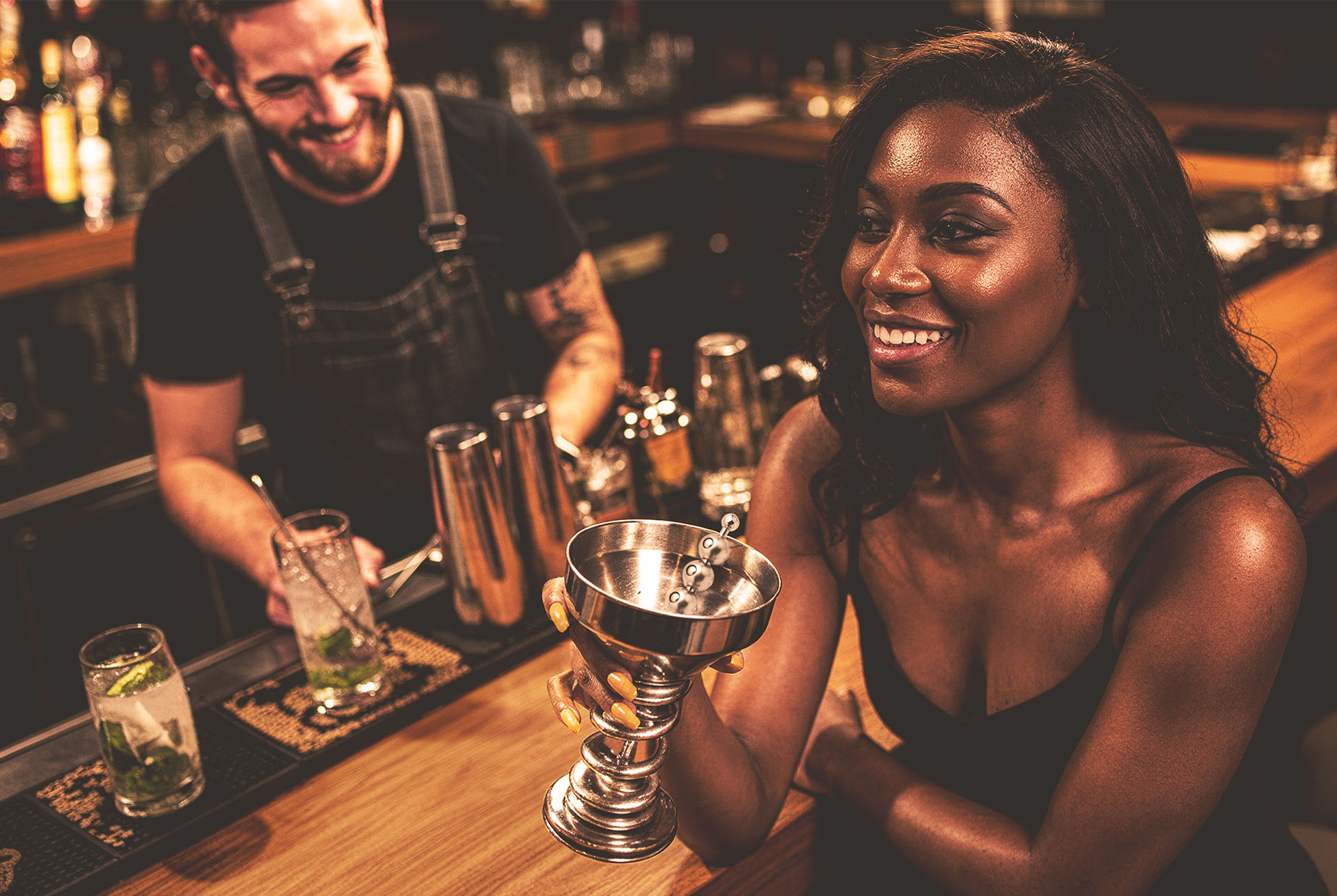
Garage bar. This is the scene a shoot budget could not buy in 2017.
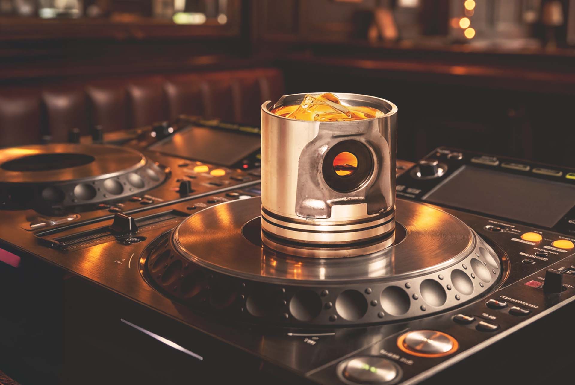
A piston tumbler parked on a turntable. Same knurling, same machining, different room.
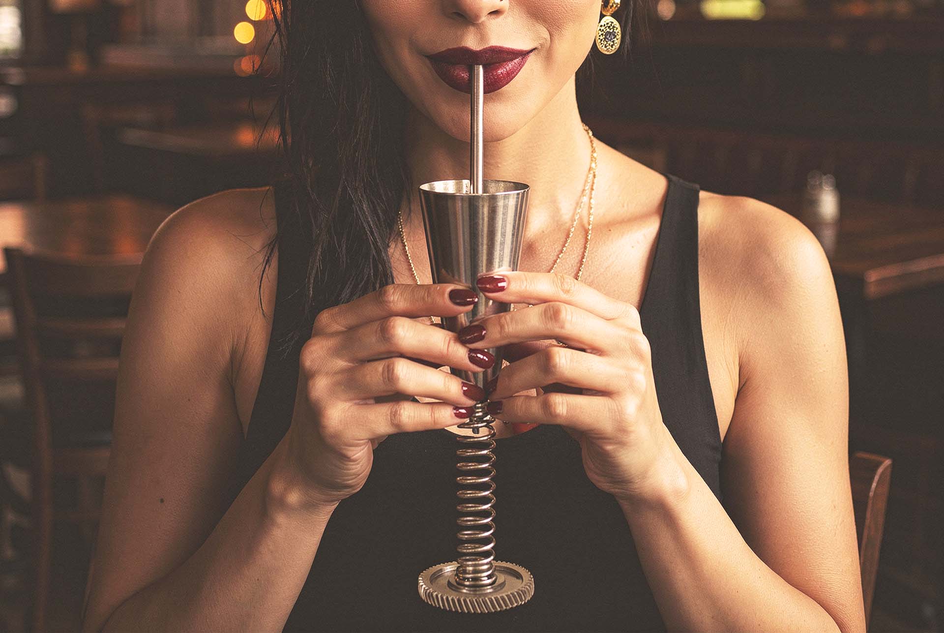
Spring stem cup, metal straw, dark bar. Barware you drink from, not barware you photograph.
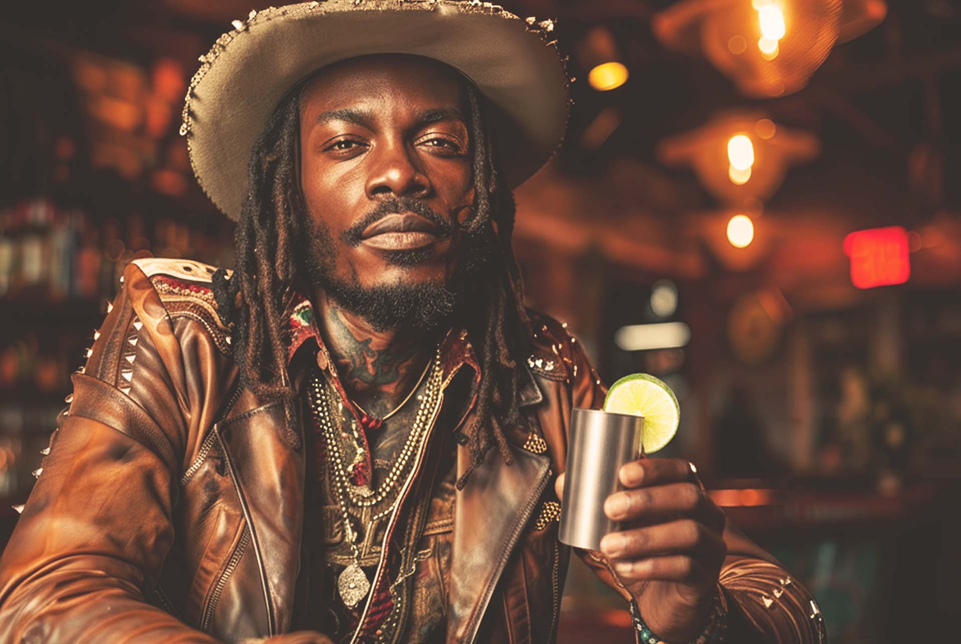
Held, not styled. Drinkware only earns its price in someone's hand.
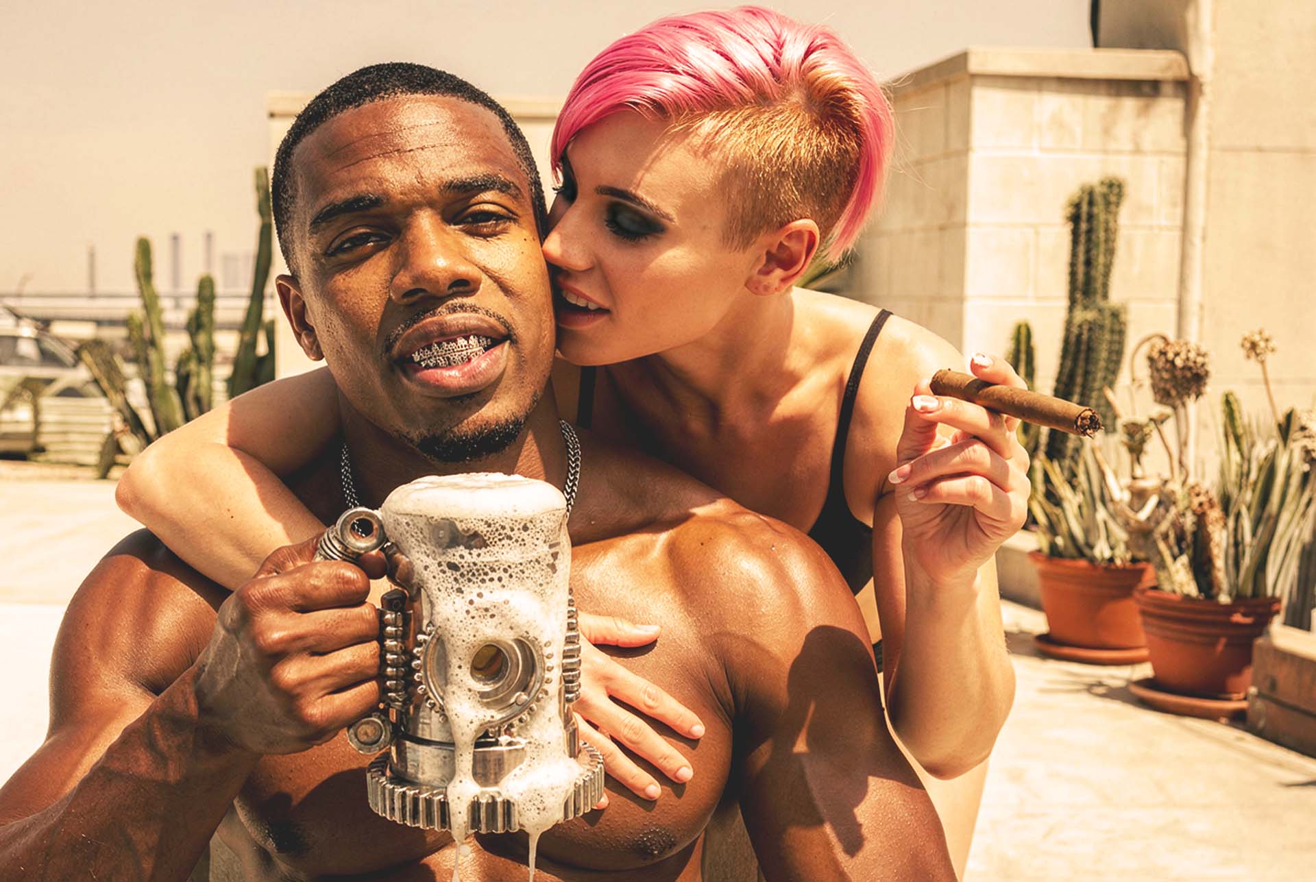
The stein in daylight, cigar optional. Concept work still has to survive real hands.
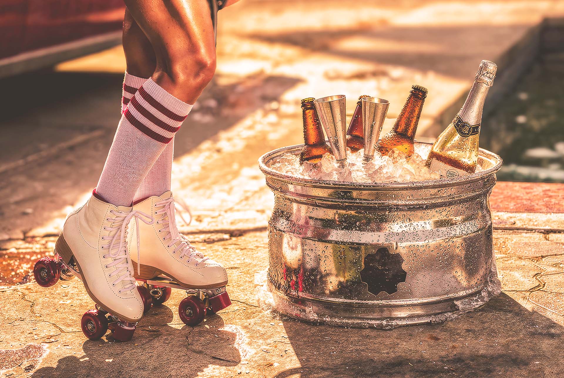
A car rim as an ice bucket, poolside. The joke is structural, not printed on.
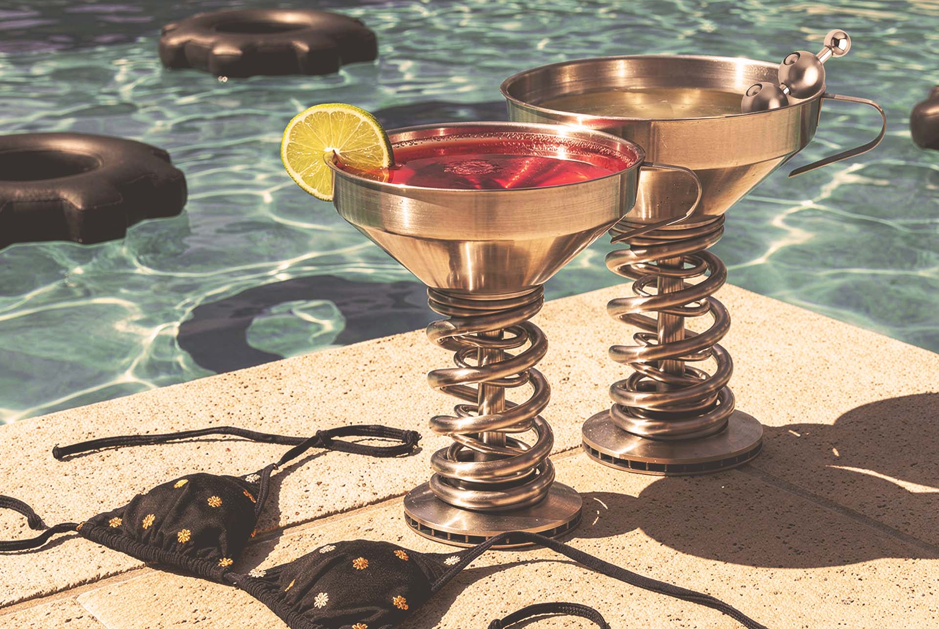
Poolside coupes on coil spring stems. The suspension is the stem.
PROJECT CLOSE
The point was never to fake a product. It was to show the brand thinking, from a name stamped like a part to a world you would actually want to drink in. That is the work, whether the tool is a pencil, a camera, or a model.
Identity, naming system, packaging architecture, a twelve piece product line, lifestyle campaign
Sketched 2017. Shelved. Rebuilt 2026.
Brand design and art direction throughout. AI directed visualization for the scenes a shoot budget could not buy.
Every name, mark, color, pattern and decision. Mine.
Start something
Brand identity, packaging and creative direction. Atlanta based, working remote, available now.