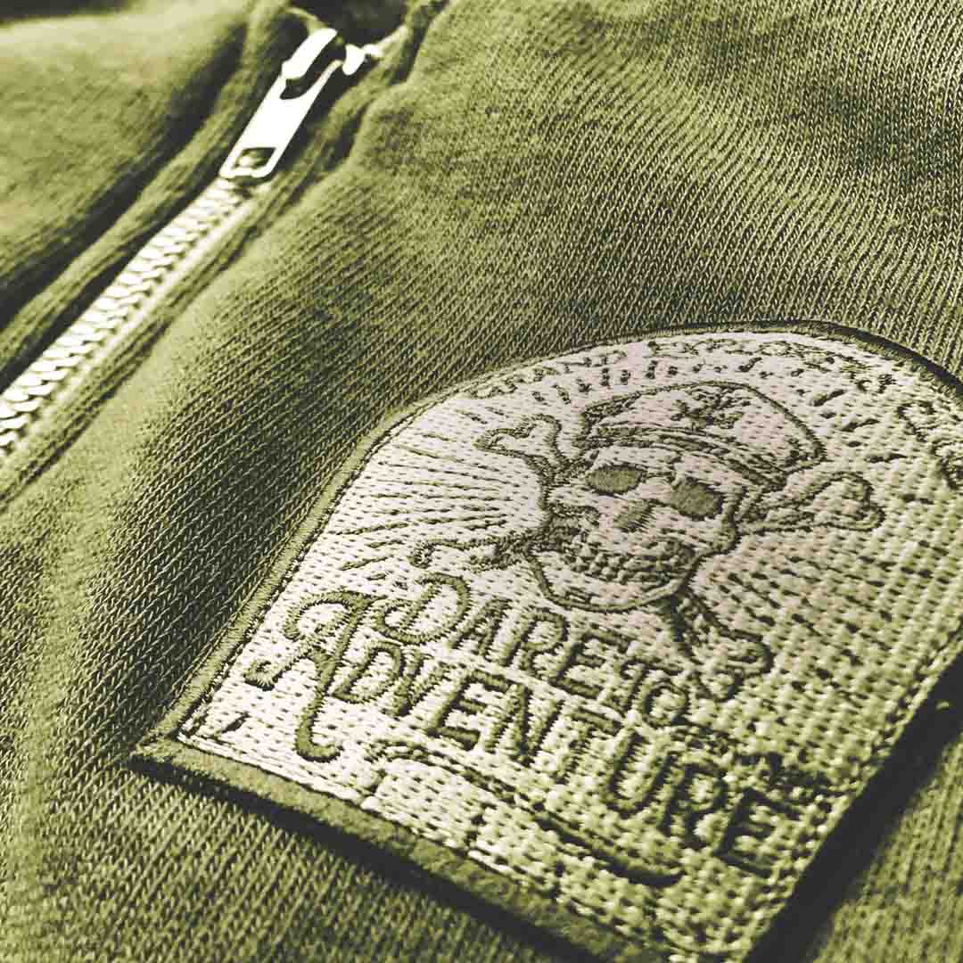
The skull logo was my first and only sketch.
Jeremy spent 14 months traveling the world. When he came back, he wanted to make things for people who wander — leather flasks, handcrafted goods, apparel built with the kind of quality you only understand after sleeping in enough bad hostels. He gave me the brand. I didn't waste it.
The client loved that it was rough, uneven, a little wild. 'It's a pirate brand,' he said. 'It's not supposed to be perfect.' That honest ugliness became the entire design brief. Every decision after it filtered through that same lens.
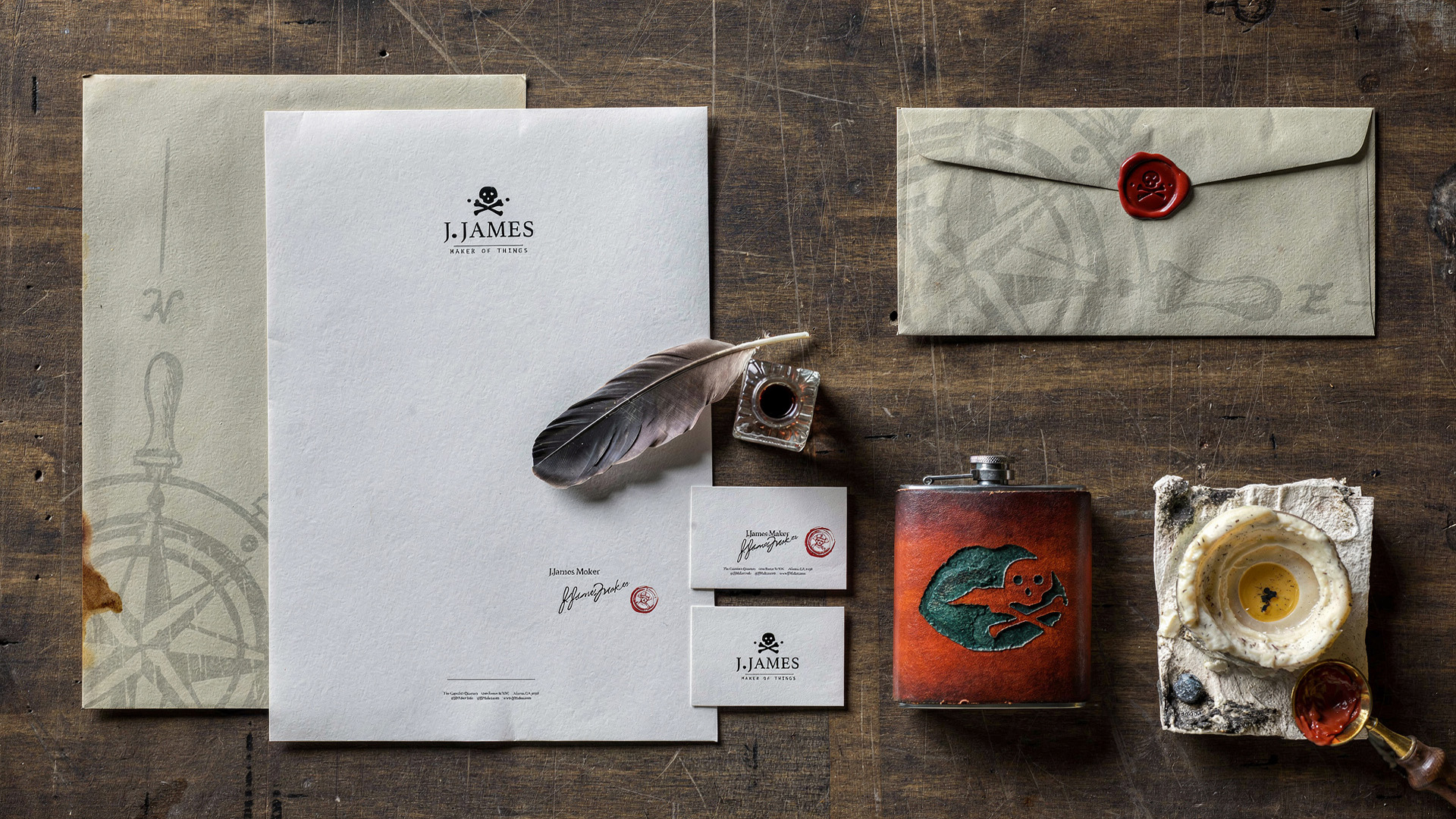
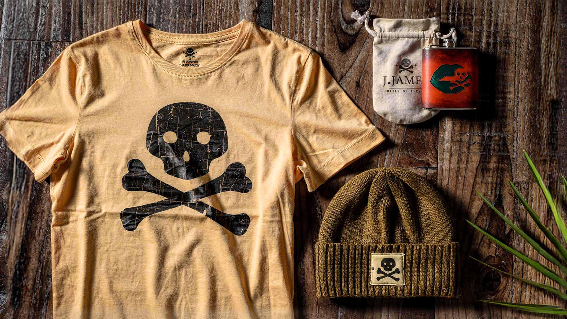
The brand spanned two apparel collections, in-house screen printing, handcrafted leather flask production with custom embossing, and two retail storefronts — the Goat Farm Atlanta and MET ATL. Identity, apparel graphics, product design, packaging, display systems. Every touchpoint built from the same restless spirit the brand was founded on.
"It's a Pirate Brand. It's Not Supposed to be Perfect."


Strategic Insight
J. James occupies the space between artisan craft and lived experience. A brand for people who make things and go places, who value the object because they understand what it costs to build one by hand. The audience is not a lifestyle consumer looking for an aesthetic. They’re someone who recognizes authenticity when it’s in front of them, and rejects its absence just as quickly. The rough skull, the hand-embossed leather, the screen-printed apparel produced in-house: these aren’t production choices. They’re brand proof points. The imperfection is the argument.


Creative Direction
One rough mark. Five deliberate decisions.
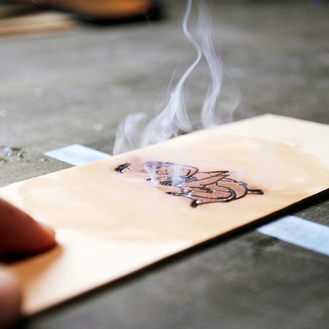
On the skull mark
First sketch. No revisions. That’s not luck. That’s what happens when the brief is understood completely before the pencil moves.
On imperfection as language
The uneven line weight in the skull is load-bearing. Clean it up and the brand stops being honest. Every production decision that followed held this line.
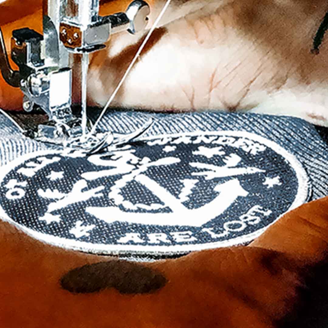
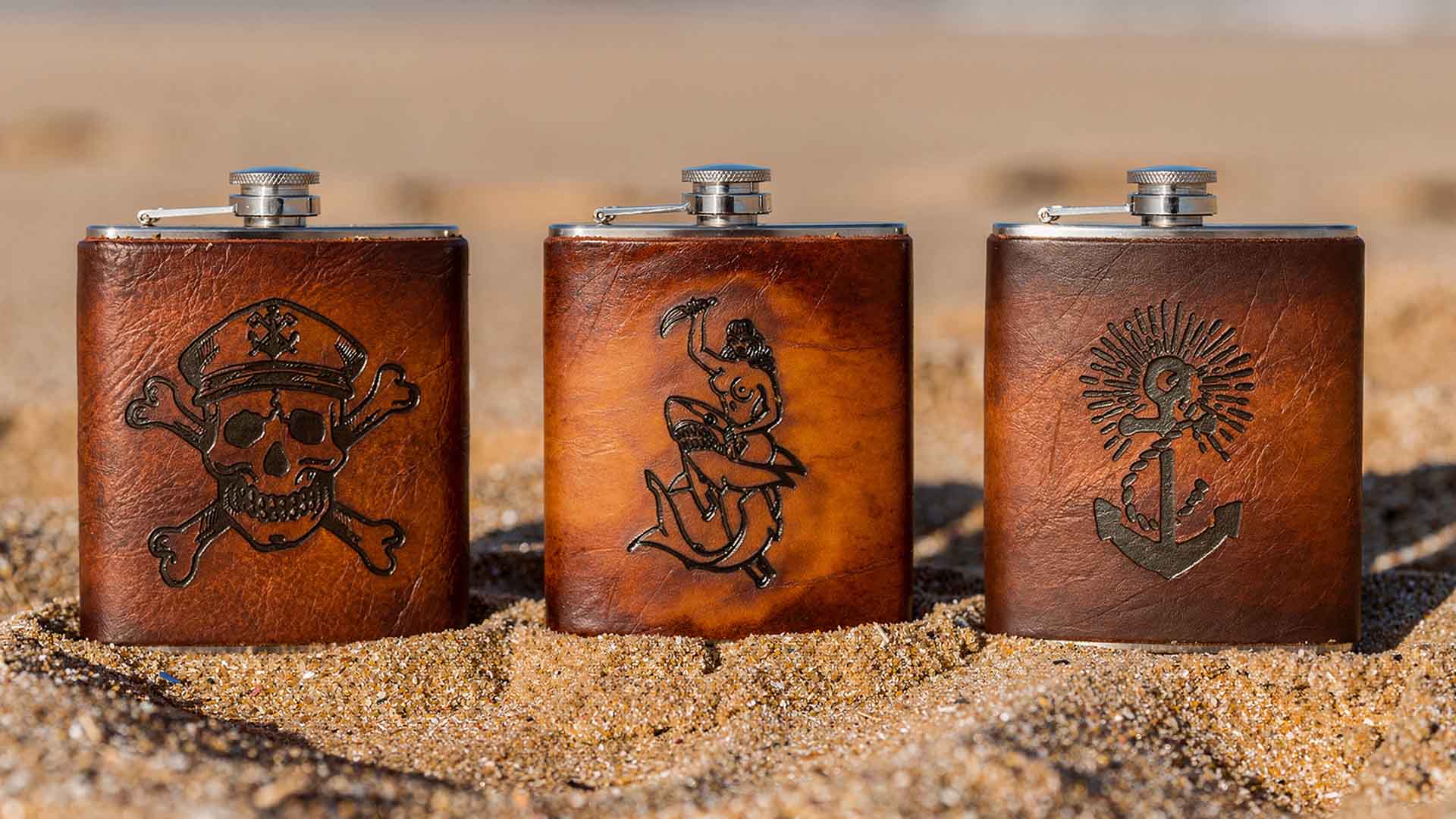
On leather flask production
The brand embossing on the flask is the same mark on the hang tag is the same mark on the screen-printed chest. Identity discipline across wildly different surfaces and production methods.
On The Wanderer vs. The Captain
Two collections. One world. The Wanderer reads worn, sun-bleached, horizon-chasing. The Captain reads darker, more deliberate. Same skull. Different ship.
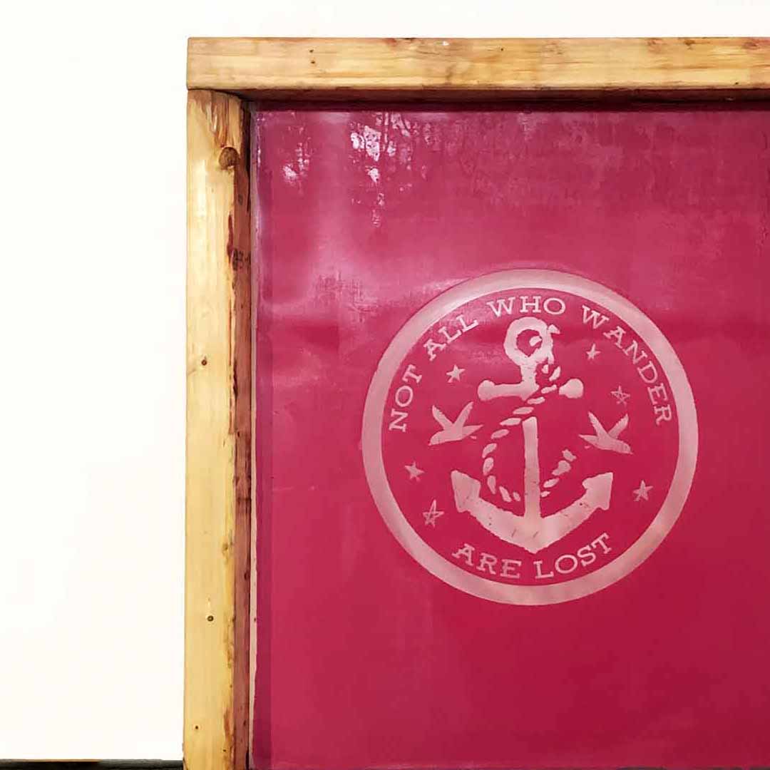
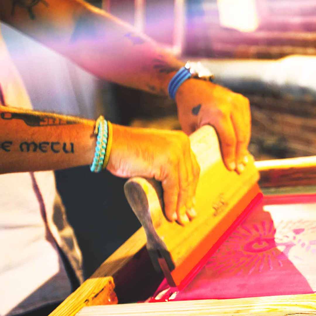
On screen printing in-house
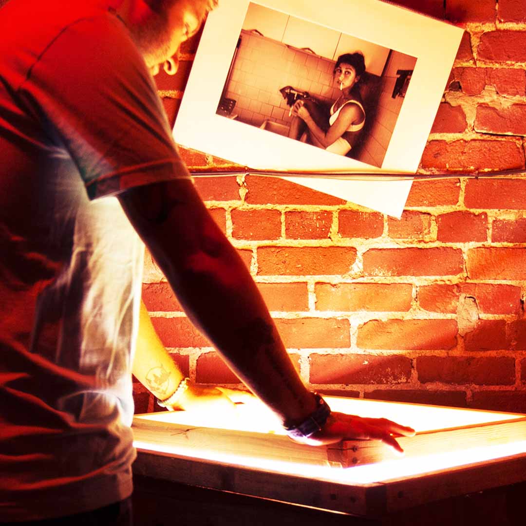
Production as brand expression. The fact that the apparel was printed in-house isn’t incidental. It’s the proof of the philosophy. Makers make.


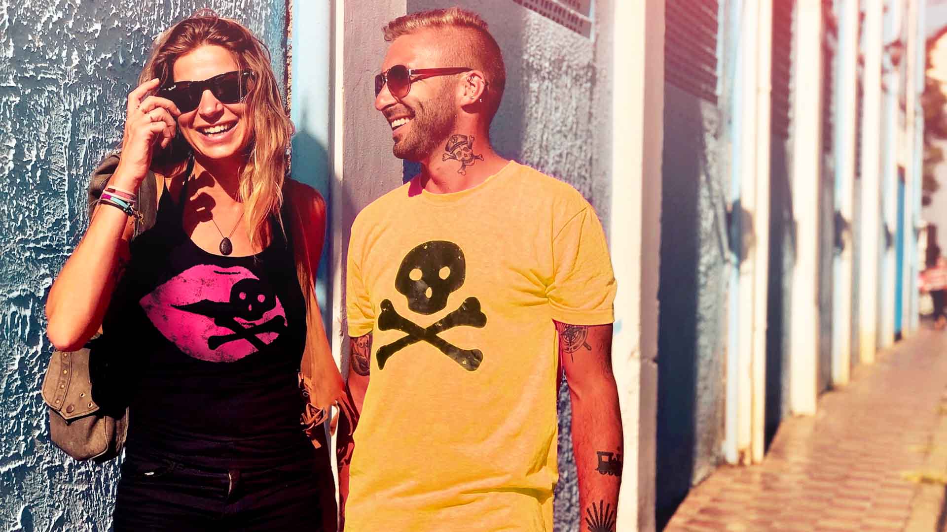
The brand had to work outside the studio.
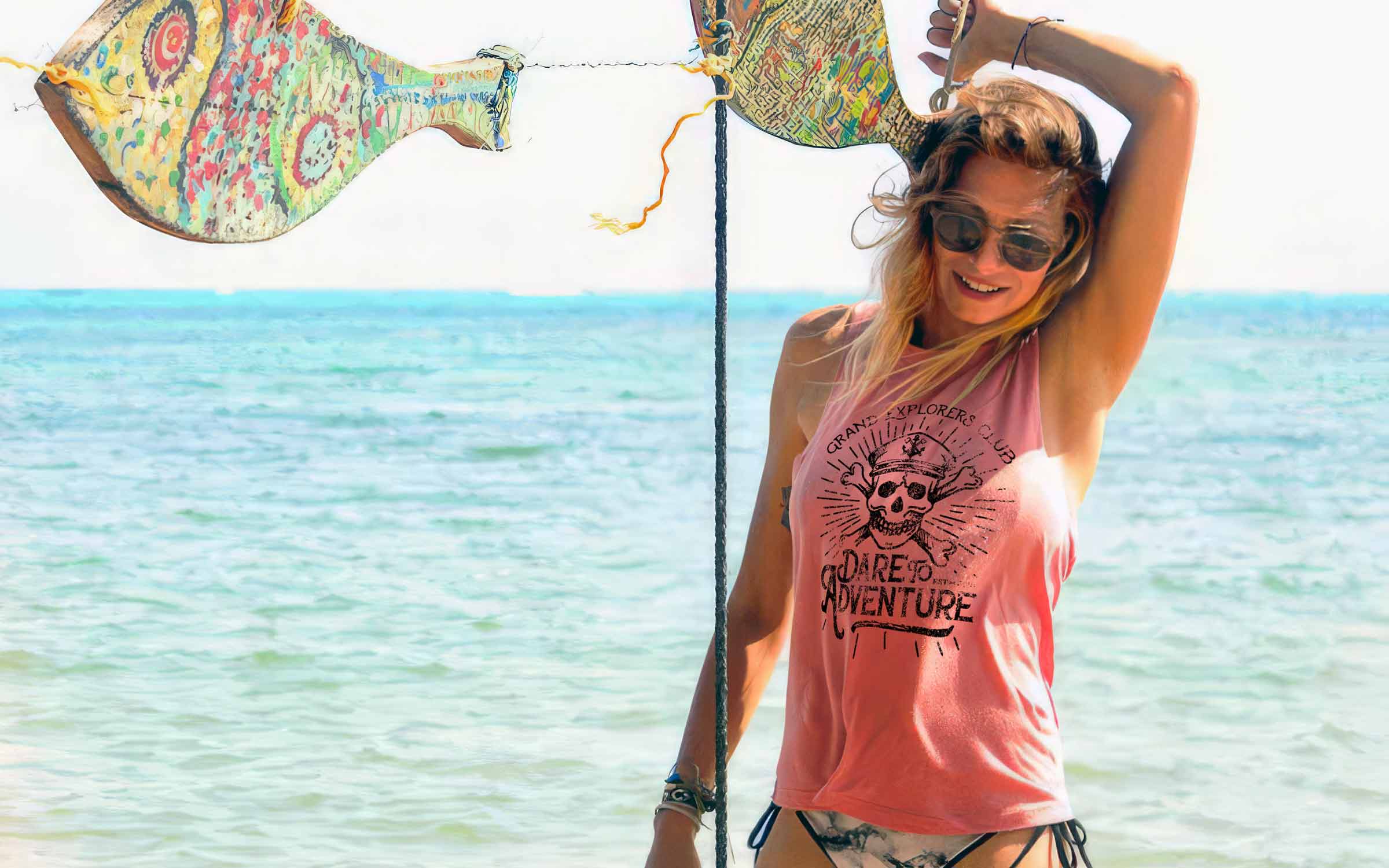
J. James was never meant to live only in styled product shots. During a trip to Nicaragua, product was brought along and handed to locals and travelers for an impromptu field shoot. The goal was simple: see whether the brand felt real in the hands of real people, outside the control of a studio. It did. The worn leather, handmade details, and in-house apparel felt connected to travel, labor, and place. With 15% of sales supporting Helping Hands Nicaragua, an organization we visited firsthand, the shoot became more than content. It became proof that the brand’s authenticity was not an aesthetic choice. It was the point.


"We brought the product down with a simple plan. Real people picked it up, wore it, carried it, and the brand made sense."
Project Close
J. James Maker of Things is rare — a brand where the identity and the product philosophy are the same thing. The skull that wasn’t cleaned up. The leather that was embossed by hand. The apparel that was screen-printed in-house. Every decision in the system was a decision to stay honest. Twenty years of practice produces the ability to recognize that kind of brief for what it is — and the discipline not to improve it past the point of truth.