A strong mark should feel specific immediately and inevitable over time.
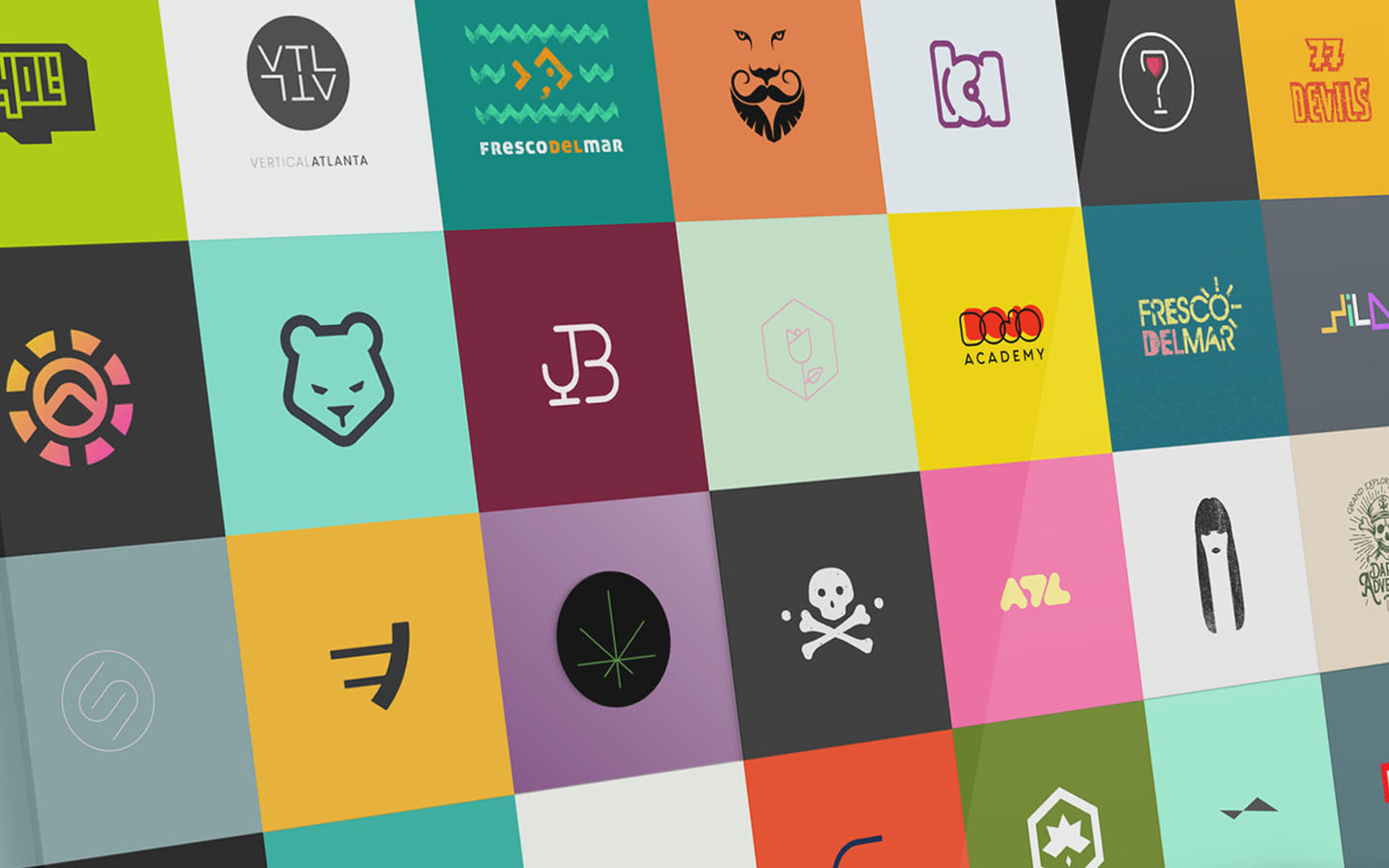
This collection spans twenty years of identity work across hospitality, fashion, real estate, education, music, wellness, consumer products, and independent brands.
The visual language changes because the business changes. What stays constant is the standard: every mark must communicate clearly, work at any size, and stand on its own before the name is explained.
Different industries. Different answers. The same standard.
Twenty years of identity work, distilled to the marks that still hold up.
Creative Direction
Range is not inconsistency. It is proof that the idea comes before the style.
ON CURATION
Not every mark from twenty years of practice belongs here. The ones that remain are the ones that solved something specific and still read clearly without context.
ON CONCEPT
The strongest marks reward a second look. Their shapes are simple, but the thinking behind them is not.
ON RANGE
A skateboard brand, a court-reporting firm, and a yoga studio should not look alike. The discipline is knowing what each identity needs to become.
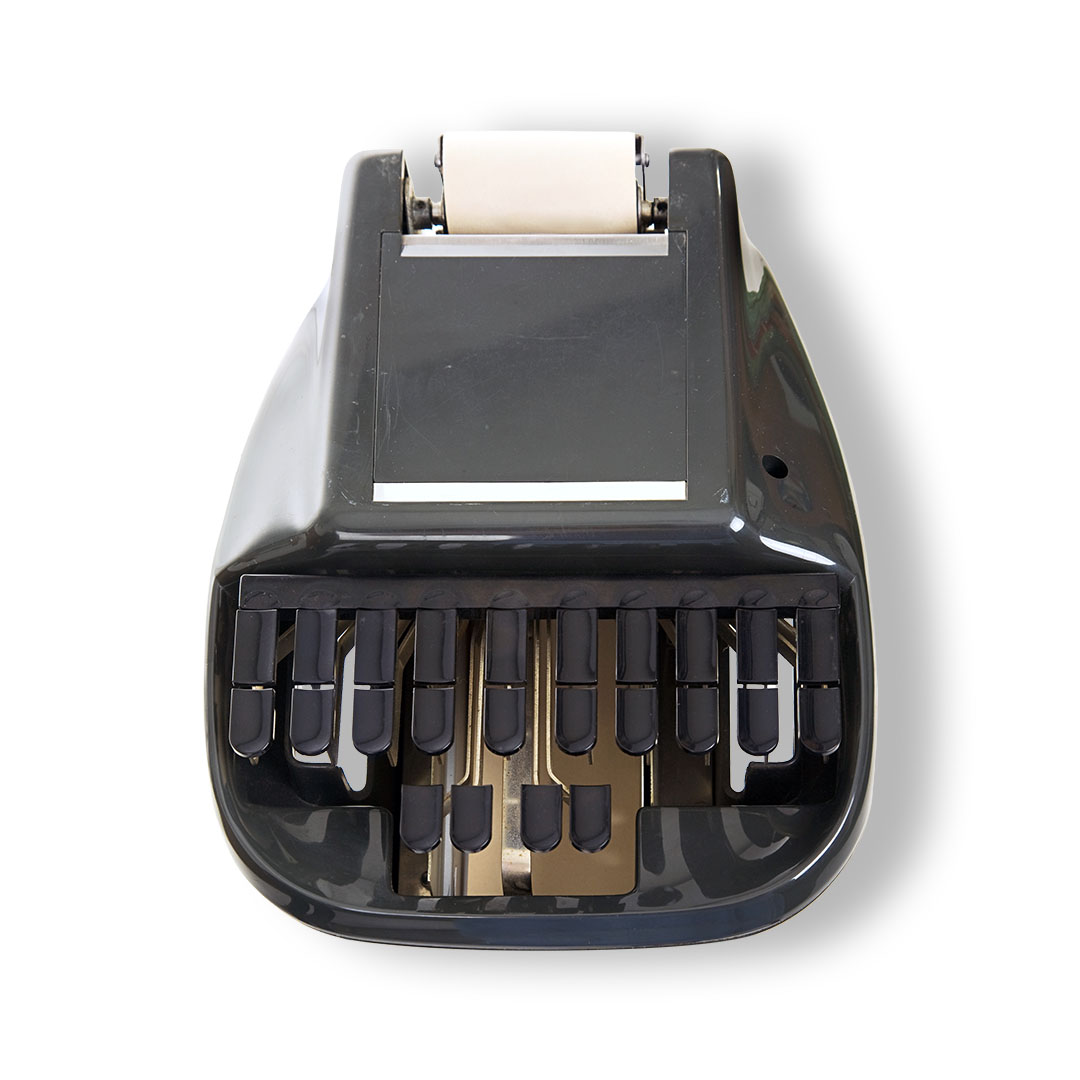

A stenography machine, made into a monogram.
A sharper identity built to earn trust at first glance.


Two marks. Two international annuals. Selected from tens of thousands of submissions.
Project Close
Twenty years later, the standard is still the same. A strong mark should feel specific on day one and inevitable five years later.
