Replace with Hero Image Asset
Logo Design · Brand Identity
The Anguished Barber arrived as a brief unlike any other. The client — opening Georgia's first barbershop with a full liquor license — presented his vision for the interior using a hand-built LEGO model. Every spatial decision in that model had meaning. That kind of client changes how you work.
The name came from a personal obsession: Salvador Dali's painting *The Anguished Man*. The owner carried it like a reference, not a concept. So I went directly to the source. I pulled the color palette straight from the canvas — not a moodboard interpretation of it, not "Dali-adjacent" — the painting itself. If the name is Dali, the color is Dali.
The mark carries a hidden gesture: a frowning expression embedded in the letterform, with a falling teardrop off the "A" creating deliberate asymmetry. The kind that reads immediately as intentional, not accidental. Controlled distortion. Emotional precision.
The brand scaled outward from there — business cards, cocktail menus, branded glassware, signage, and interior direction. A place that does two things at once required a brand that held both without flinching.

The brief.
Strategic Insight
The modern barbershop market has bifurcated: heritage revival on one end, fast-service utility on the other. The Anguished Barber exists outside both. It's a third space — part saloon, part salon — built for men who want an experience, not just a haircut. The brand had to signal sophistication without softness, masculinity without aggression, and wit without irony. The Dali reference does all of that without explaining itself. That's exactly the point.
“The anguish is in the letterform.”
Color · Lifted from the Canvas
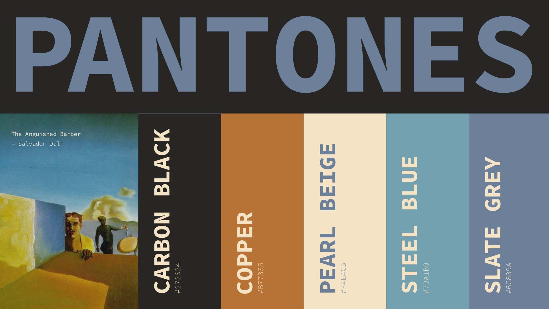
Colors belong in a room with low light and good whiskey.
“The color palette came directly from a Dali canvas.”
Logo Development

01 — Sketch
02 — Refined
Asymmetry as intention, not accident.
03 — Final
“A place that does two things at once required a brand that held both.”
Color · Lifted from the Canvas
Colors belong in a room with low light and good whiskey.
Creative Direction
On the Logo
The anguish is in the geometry. The frown lives in the letterform. The teardrop on the ‘A’ is a typographic gesture — one extra shape that changes everything about how the mark reads emotionally.
On Color
Lifted directly from the Dali canvas. Ochre, deep burgundy, smoke. Colors that belong in a room with low light and good whiskey.
On the Cocktail Menu
Designed to be held, not scanned. The weight of the paper matters. The brand should feel like the place.
On Glassware
A logo on a glass is only interesting if the logo earns that surface. This one does.
On Atmosphere
The LEGO model was the real brief. Every interior decision the client built into that model — proportions, adjacency, light sources — informed the brand direction. Rare that a client brings you something that precise.
Glassware

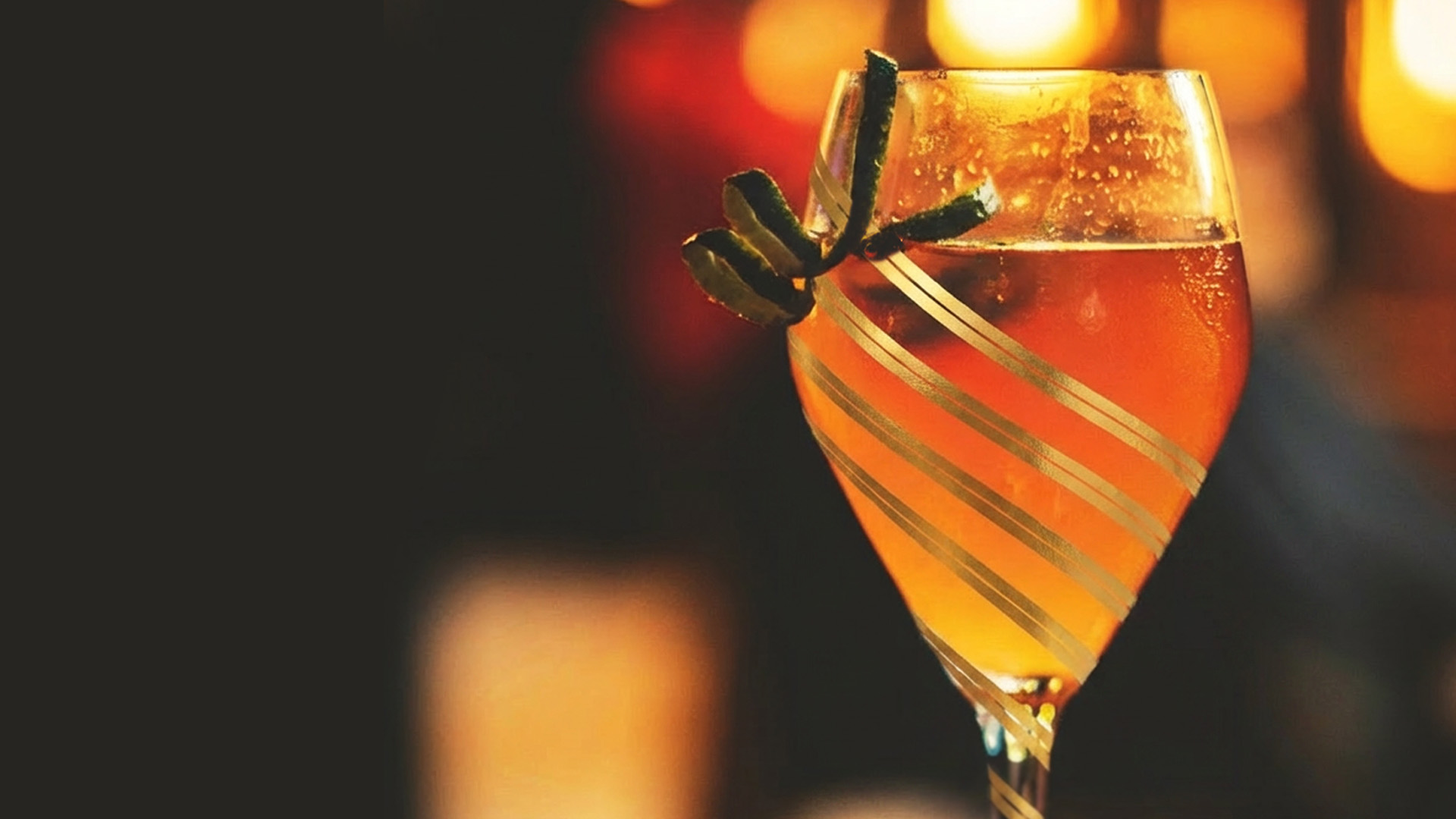
A logo on a glass is only interesting if the logo earns that surface.
Cocktail Menu
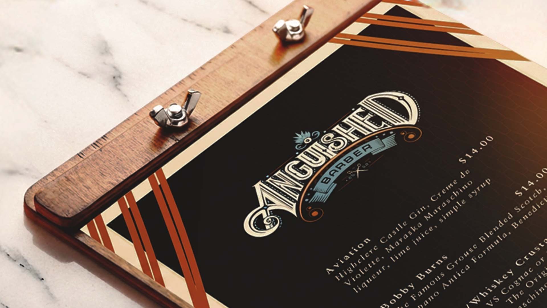
Designed to be held, not scanned.
“Built for the man who wants an experience, not just a haircut.”
Project Close
The Anguished Barber is the kind of project that proves what a brand can do when the concept is genuinely strange and the execution refuses to explain it. The asymmetry in the mark doesn’t ask for your permission. The color doesn’t apologize for where it came from. The whole system operates on the assumption that the right customer will get it immediately — and the wrong one was never the audience anyway.