


Brand Identity · Logo Design
Build a singular brand identity for a barbershop and cocktail bar, with one mark that holds the weight of both.
Role
Creative Direction · Brand Identity · Art Direction
Client
The Anguished Barber · Atlanta, GA
Industry
Hospitality · Barbershop · Food and Beverage
Deliverables
Logo · Identity System · Signage · Menus · Branded Glassware · Interior Direction
Recognition
Licensed Barbershop and Cocktail Bar
Challenge
A barbershop with a full liquor license, and a client whose only direction was a barber logo he liked on a trip to France. No brief, no references. Two businesses in one room and one mark expected to carry both.
Approach
Kept visiting the build and art directed off what was going up. Locked the logo onto a frowning face, pulled the pattern straight off the bar millwork, and took the palette from the Dalí painting the place is named after.
Outcome
One system with no seam between the shop and the bar. Logo, pattern, signage, menus, matchbooks, napkins and two treatments of branded glassware, all built from a single sentence of direction.
Overview
The client was opening a barbershop with a full liquor license. The only direction he gave me was a barber logo he liked on a trip to France, and one sentence: see if you can illustrate what I'm thinking. He had also built the room in LEGO before it existed, which told me how he saw the space but nothing about the brand. Everything else got worked out on site, while the place was going up.
He could not describe it, so he built it. The LEGO model was the closest thing to a brief I got, and it was about the room, not the brand.
Strategic Insight
The Anguished Barber is a barbershop and a bar in the same room, so the brand had to live in both worlds at once. Someone comes in for a cut and stays for a drink, or shows up for the drink and leaves with a fresh cut, and the identity has to carry them through the whole visit. That meant working past the logo into signage, menus, glassware, and the feel of the room itself, so the place reads as one experience instead of two businesses sharing a lease.
Brand Identity

The brief was a logo he half remembered from France. The frowning face was the thread I decided to pull.
The anguish is in the letterform.

Tightened by hand. This is the sketch I sent to check I was on the right track. The answer was a thumbs up, and that was the whole round of feedback.
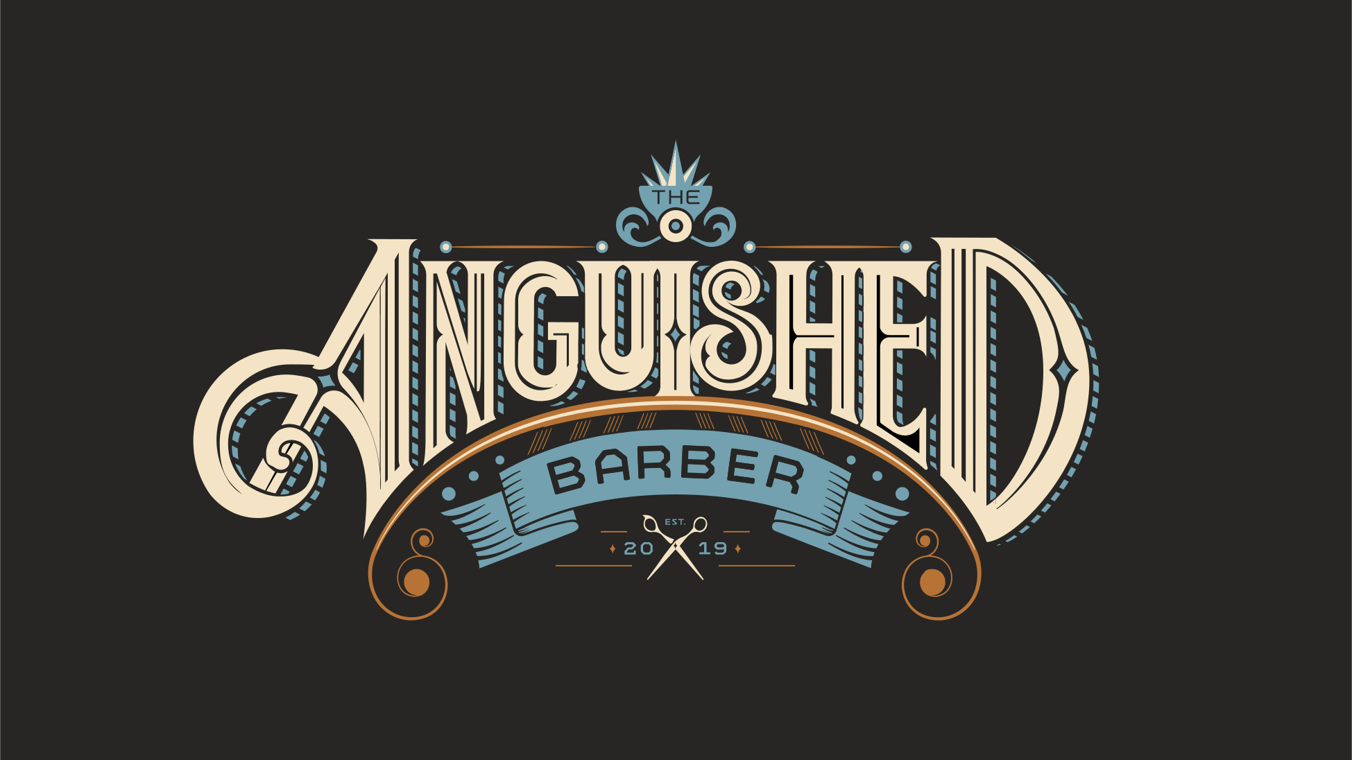
The finished lockup. The teardrop on the A is one extra shape doing all of the emotional work.
Creative Direction
On the Logo
The anguish is in the geometry. The frown lives in the letterform. The teardrop on the A is one extra shape that changes how the whole mark reads. Early exploration and sketch development were done with Michael Steffen, a collaborator of more than twenty years.
On Color
Lifted from the Dalí painting the bar is named after. Carbon black, copper, pearl beige, steel blue, slate grey. Colors that belong in a room with low light and good whiskey.
On the Cocktail Menu
Designed to be held, not scanned. The weight of the paper matters. The brand should feel like the place.
On Glassware
A logo on a glass is only interesting if the logo earns that surface. This one does.
On Atmosphere
Worked out with the client, off the palette in the painting. He had built the room in LEGO before it existed, which told me how he saw the space. The rest came from being on site while it went up.
Patterns · Typography · Pantones

Five values off the Dalí the bar is named for. Carbon black, copper, pearl beige, steel blue, slate grey.

A machined typeface, chosen so it never competes with a mark this ornate.

The pattern did not start on paper. It came off the bar that was being built, then went back onto everything else.
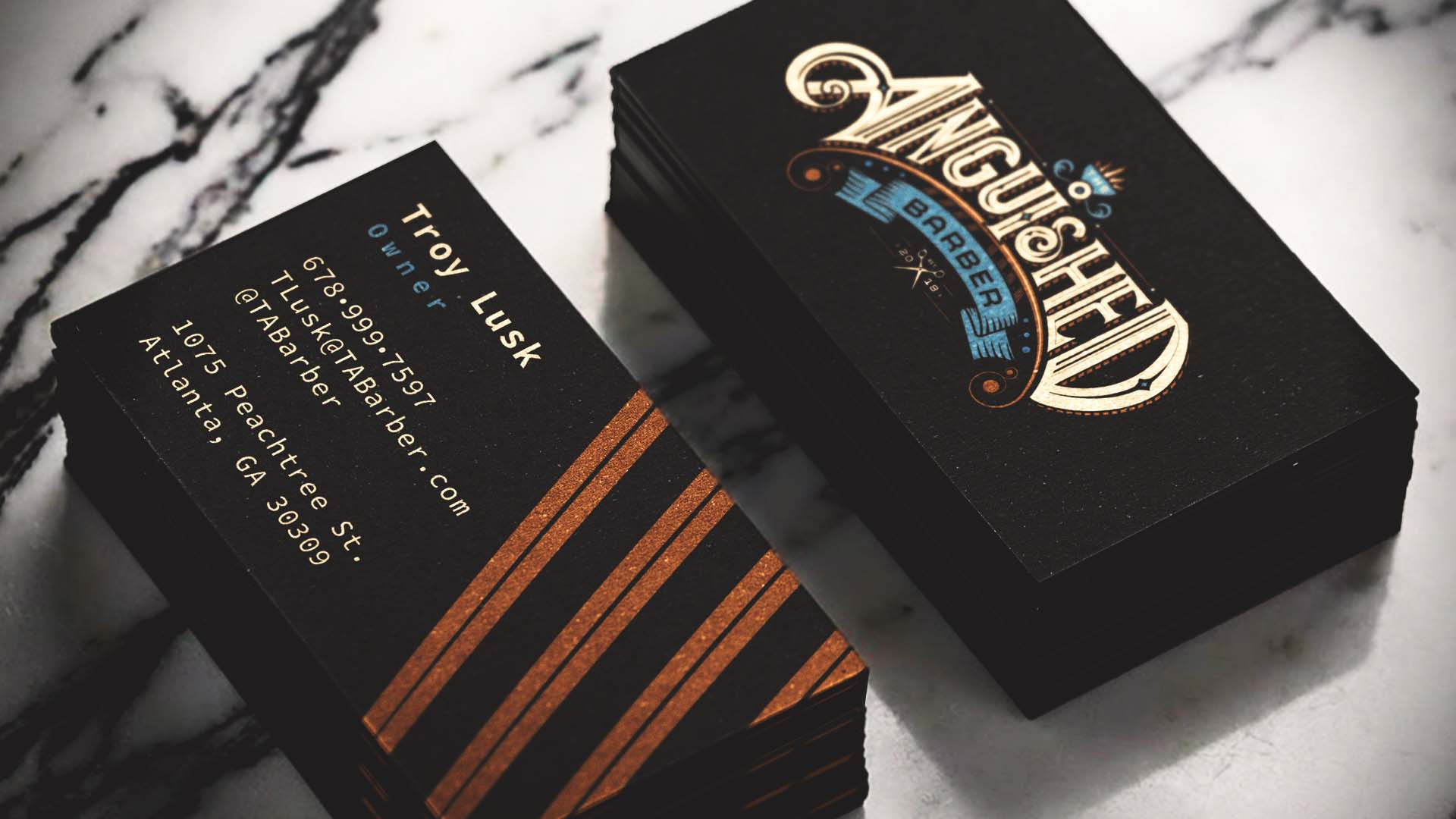
Black stock, gold mark, contact details set in the mono.
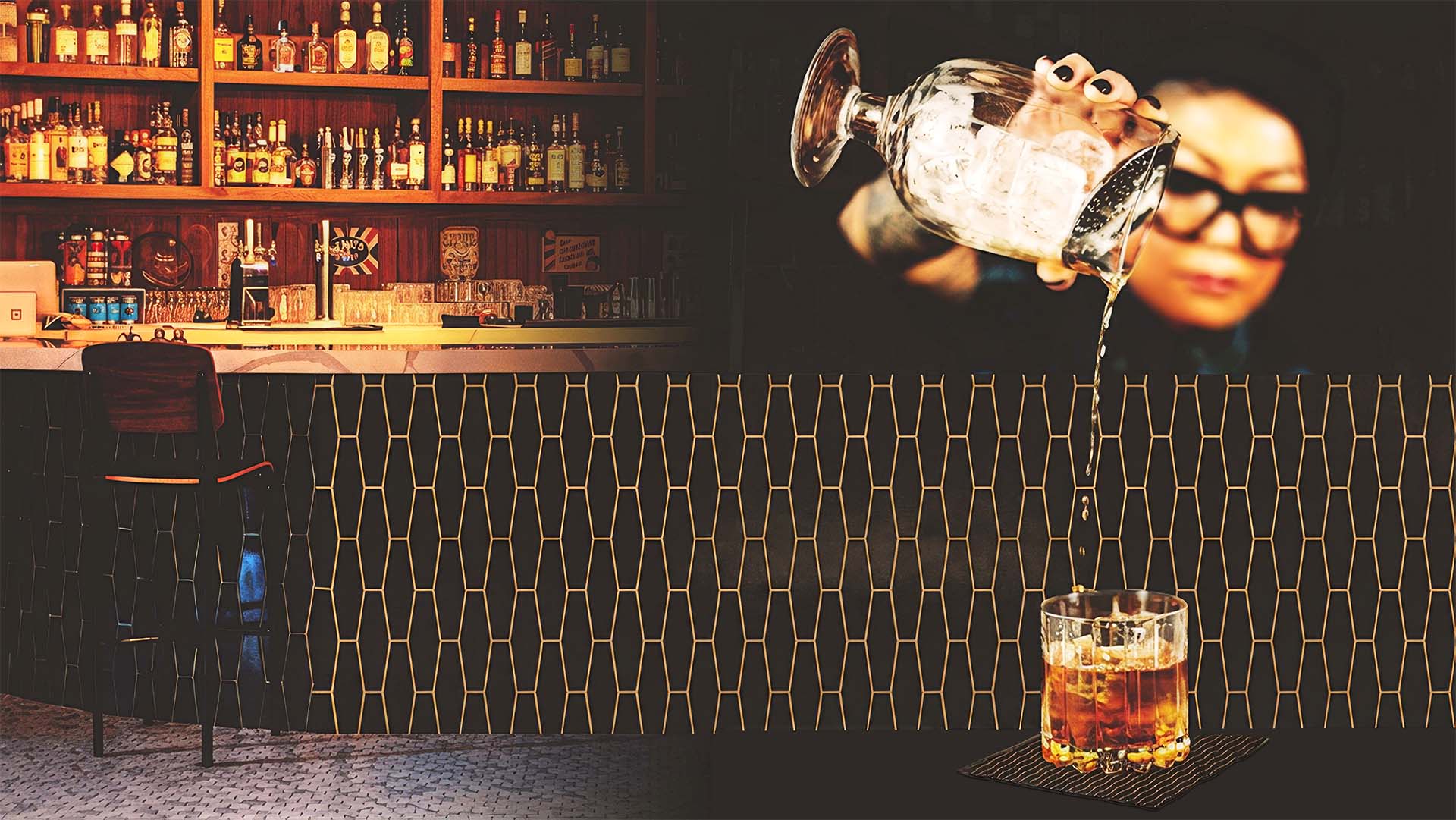
The source. I kept visiting the build, liked what was going up, and took the brand out of the room instead of putting it in.
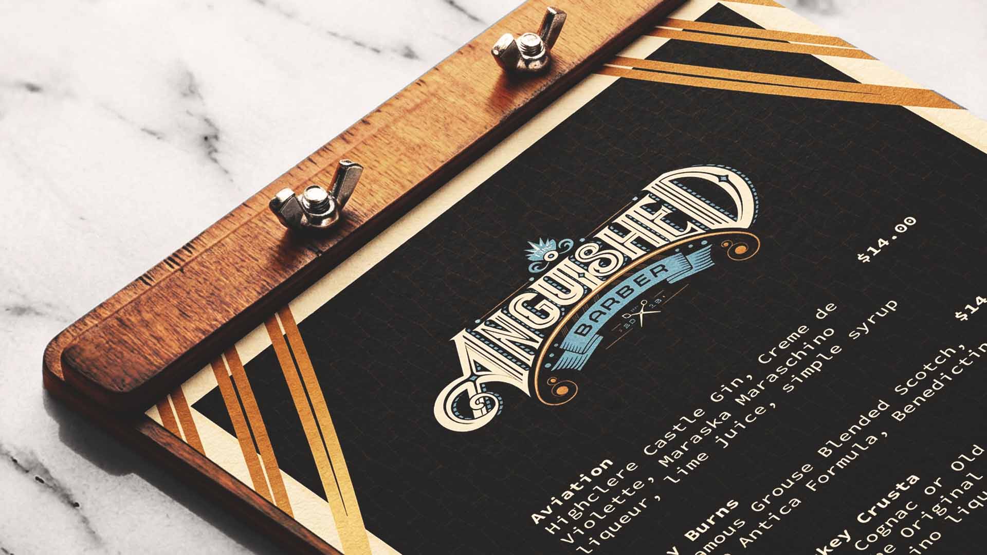
The menu was designed to be held, not scanned. The weight of the board is part of it.
Branding

Matchbooks and napkins were part of the system, so the brand reaches the table without a sign on it.
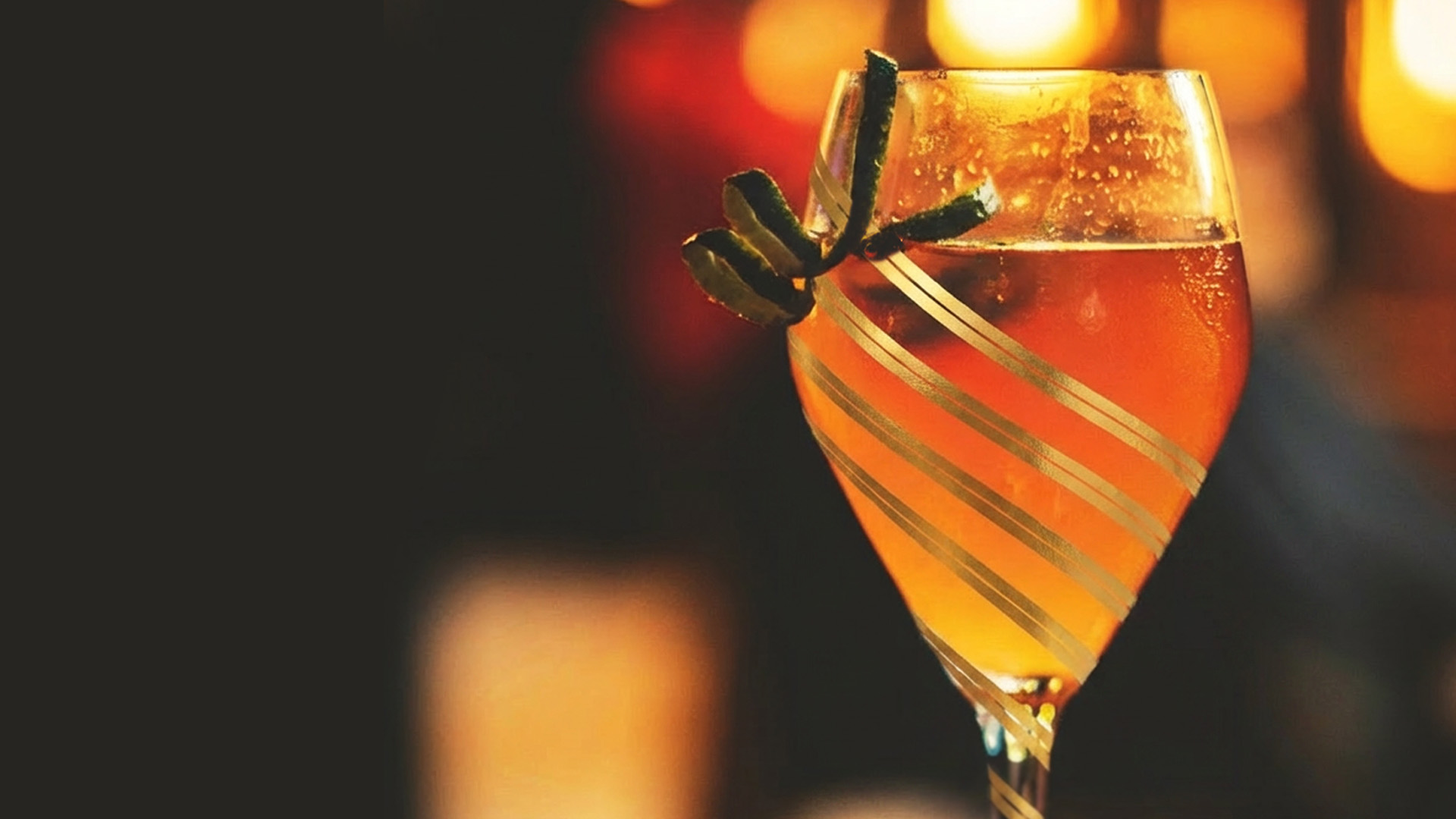
The second glassware treatment. Three bronze stripes, no wordmark, for when the logo would be too loud.
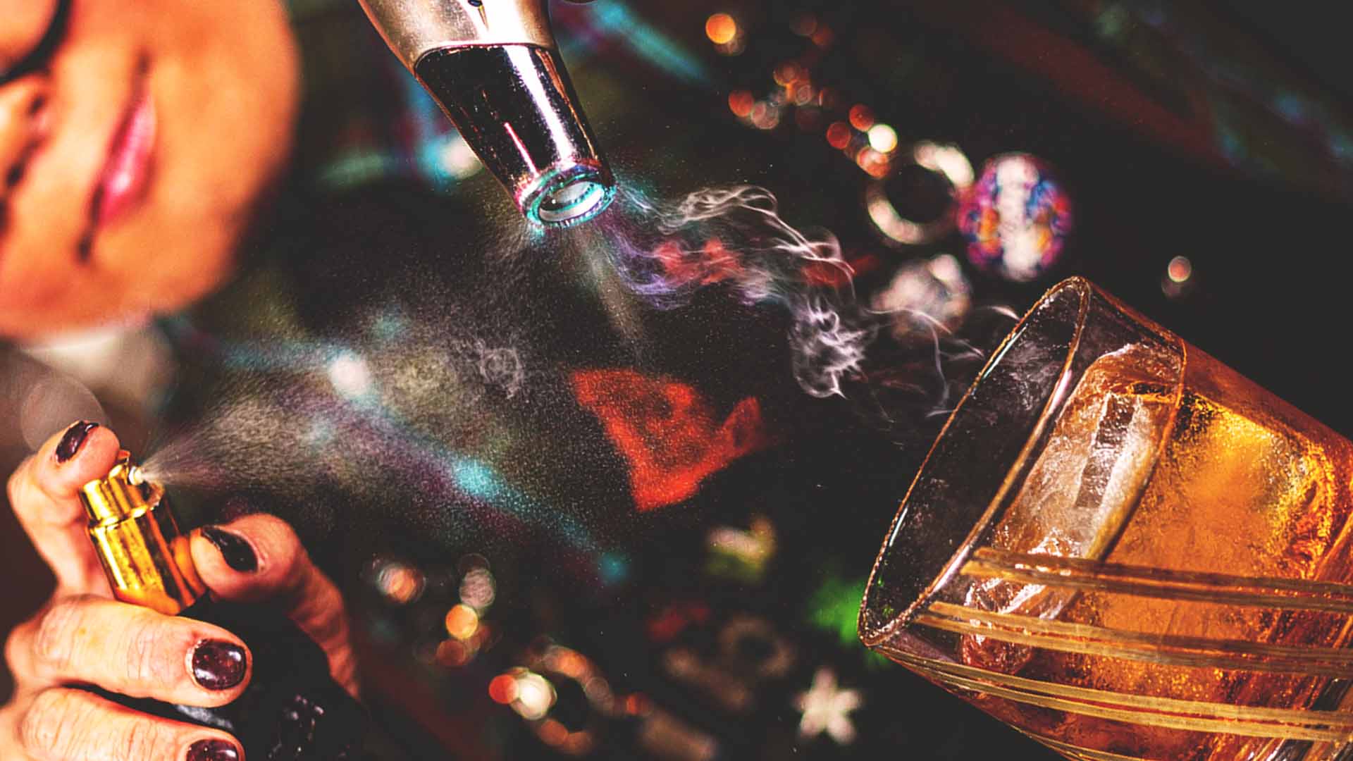
Nobody asked for branded glassware. I proposed it, because the drink is the thing people photograph.
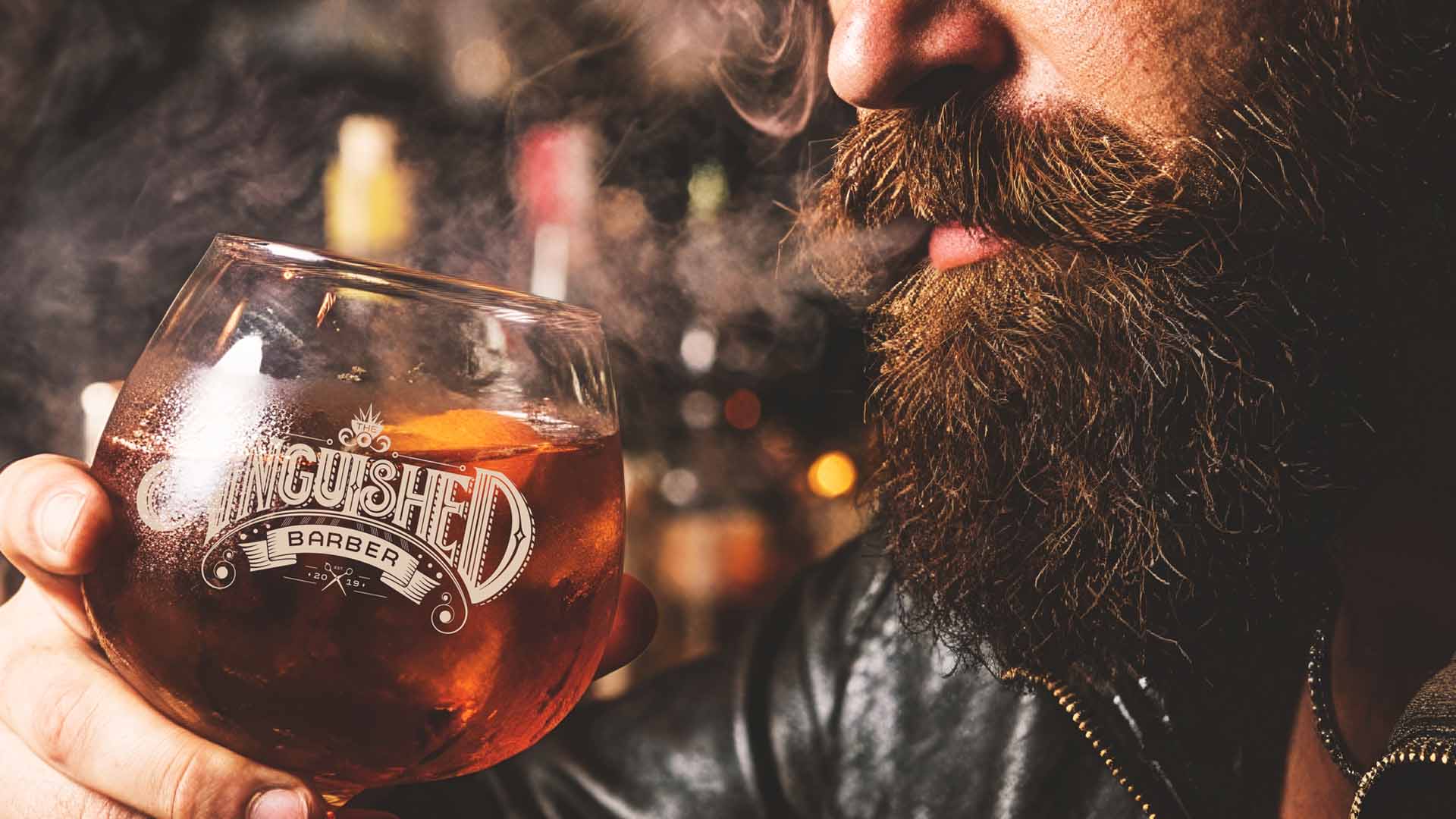
The mark in the hand, at the size it actually gets seen.
Vibe · Environment
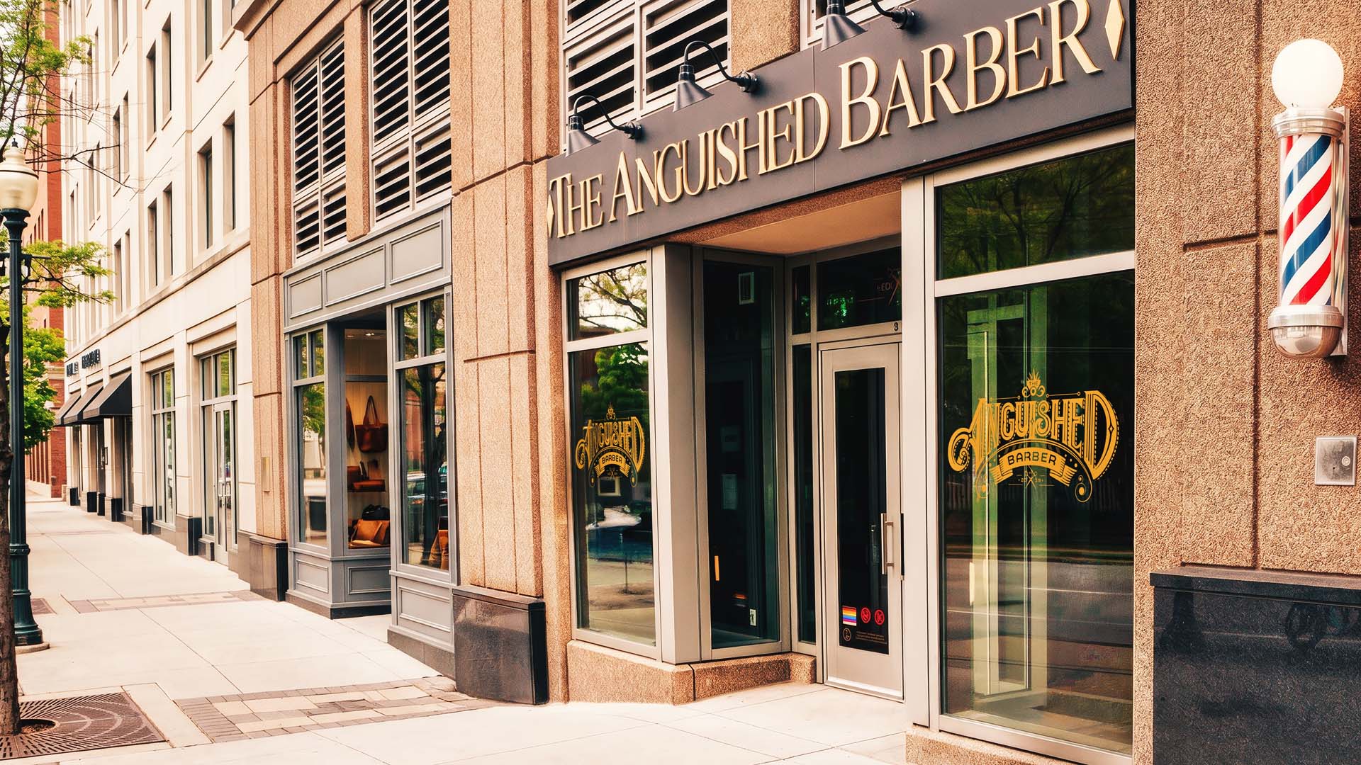
The barber pole says one business, the signage says the other, and neither apologizes.
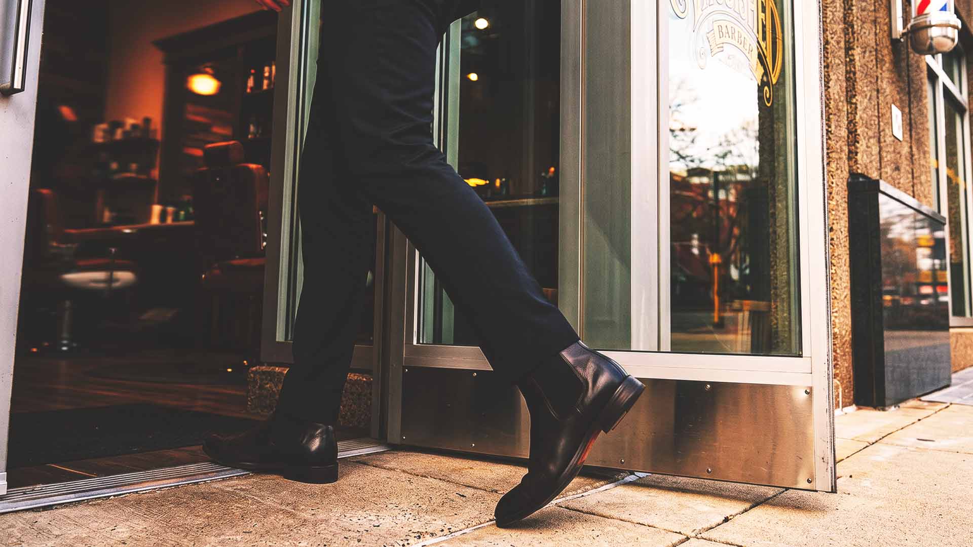
He came for a cut and stayed for a drink. That loop is the whole business model.
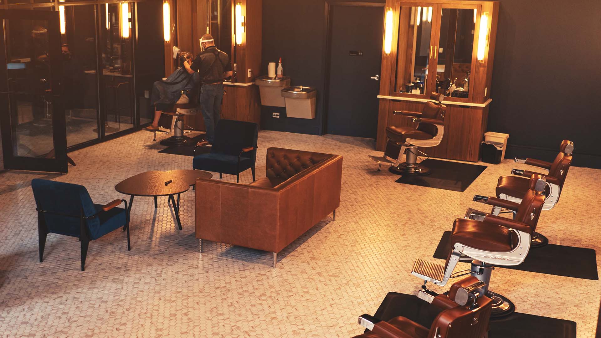
How the room should feel was worked out with the client, off the palette in the painting.
Built for the customer who wants an experience, not just a haircut.

One room, both businesses. This is the frame the whole identity had to survive.
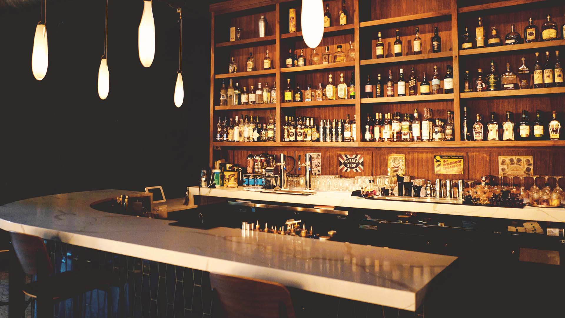
Low light and good whiskey, which is exactly the register the palette was picked for.
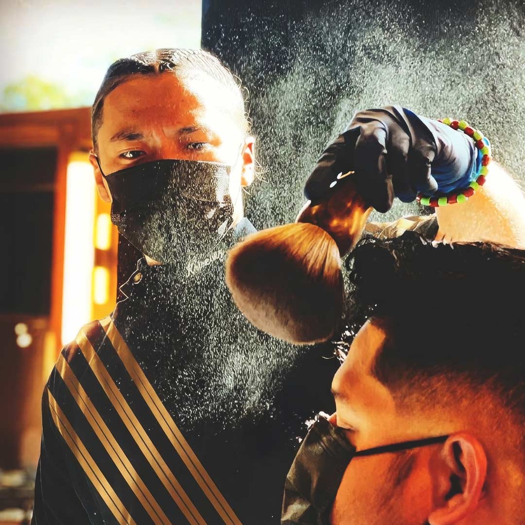
The service that pays the rent, shot like the one that sells the room.

Branded glass beside a bottle it has to hold its own against.
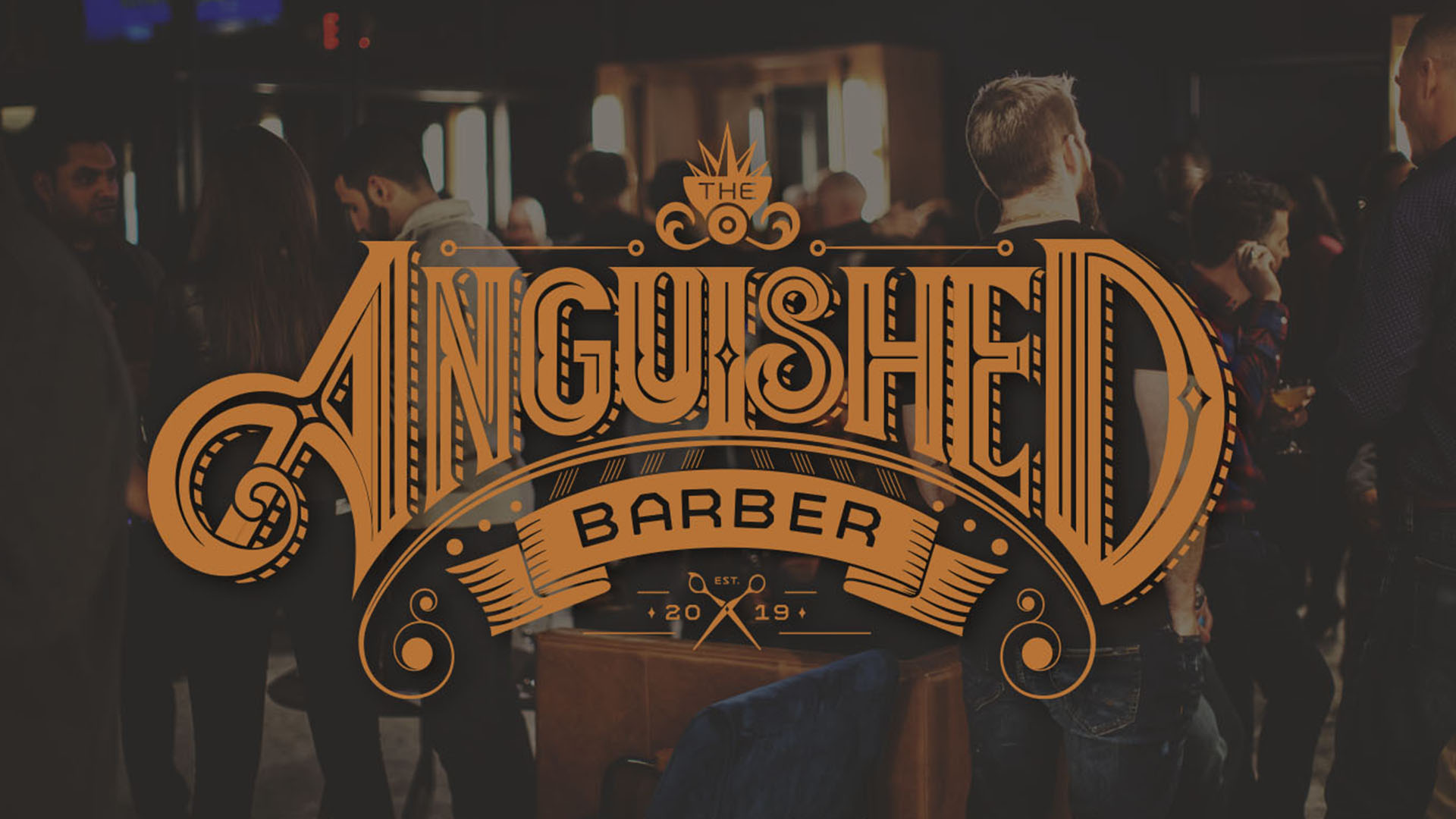
One sentence of direction, one full room. The right customer got it immediately.
Project Close
The Anguished Barber is the kind of project that proves what a brand can do when the concept is genuinely strange and the execution refuses to explain it. The asymmetry in the mark does not ask for your permission. The color does not apologize for where it came from. The whole system operates on the assumption that the right customer will get it immediately, and the wrong one was never the audience anyway.
Logo and identity system, pattern, signage, cocktail and service menus, matchbooks, cocktail napkins, branded glassware in two treatments, interior direction.
Brand designer and art director. Built from scratch.
November to December 2018, for a January 2019 opening. One month, taken slowly.
A barber logo the client liked while traveling in France, and one sentence: see if you can illustrate what I'm thinking. Part way in I sent a sketch to check the direction and got a thumbs up back. That was all of it.
Salvador Dalí, Barber Saddened by the Persistence of Good Weather, also catalogued as The Anguished Barber, 1934. The bar takes its name from the painting.
Art directed on site during construction. Elements from the build fed back into the brand, including the pattern, which came off the bar itself.
Start something
Brand identity, packaging and creative direction. Atlanta based, working remote, available now.